


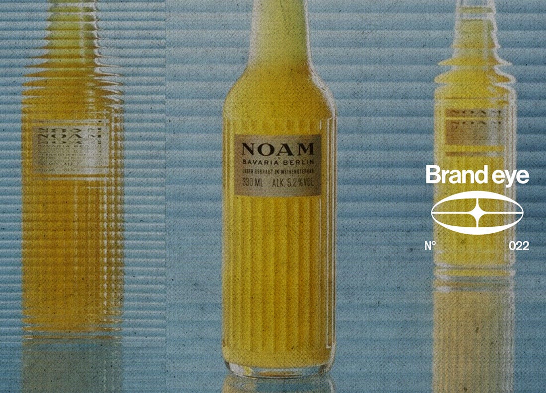
Often times founders treat branding as something that happens to a product once the product is finished. Selling is thought of as a separate process from making. Once the engineering has been signed off on and the tooling ordered product gets kicked down to a creative department charged with positioning it in the market. The problem with this kind of siloisation is that by that point the product has already largely been defined and branding is forced to work within a limited set of parameters. By keeping branding considerations apart from product design, branding is handed a job it cannot really do.
Context is there for your product whether you want it to or not, whether you choose to engage with it or not. The standards and norms of your category has started building associations for people before you’ve said a word about your product. Beer = pub. Vaccuum = utility product etc. The accumulated sentiments formed by decades of brand interactions and category marketing defaults are the environment you enter into, and when your product arrives looking like the rest of the category, it inherits all of that, including the parts you would rather not have.
Meaning your product either accepts the category’s terms or it argues with them. If you want to brand against category tropes, then that’s a decision that needs to be made before design is finalized. Because successfully counter-category product tend to do it without a word of copy, the argument is built into the thing itself.
Start with the perception, not the product
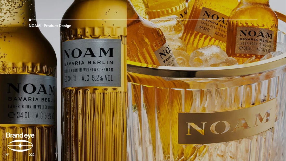
Noam Lager, product description – unfiltered, 5.2%, Hallertau hops, brewed to the Purity Law, developed with the research brewery at the Technical University of Munich. What’s unique here? Nothing really. Given that product brief and the typical stubby brown bottle, a crest, and some combination of green, brown, red and gold you’d be hard pressed to convince anyone that there was a good reason beyond personal taste to buy Noam over any other Bavarian lager, or beer generally for that matter.
But for Noam, branding started before it got to advertising and marketing, it started with the design of the object itself. Rather than competing against beer on its terms, Noam positioned itself as the drink you order when champagne, Chablis or a cocktail would be the obvious choice. To achieve that positioning, they scrapped the expected trappings of beer bottle presentation and design and made something that loudly positioned itself against a drinking culture where the expectation is that beer is a dressed down drink.
Instead of referencing the aesthetics of the brewery, browns, archaic lettering and elaborate crests, Noam took its cues from fashion, perfume, classical architecture. The clear ribbed glass bottle is conspicuous but elegant, with a fluted profile as a nod to Munich’s architecture. Its shape is borrowed from the perfume bottles not beer bottles. Noam sits comfortably next to the Moët or at a wedding table without people wondering if it’s there as a budget option. As a result Noam has ended up on lists at Soho House Berlin and Colette rather than in the fridge at the office.
The fact that Noam knows that their product design is essential to their branding and presentation is highlighted by their cooler. A transparent acrylic, gold base, LED lit which holds around ten bottles. It’s designed to sit in the middle of the table rather than under it, reiterating that this is a beer that deserves to be admired for its beauty before you ever crack it open. It aligns better with the brand ethos than a lot of campaigns manage to, because it keeps the brand present for the whole evening. That’s a manifesto product in the classic sense, and it only exists because somebody understood that the argument had to continue past the point of purchase.
Sometimes the perception is your own fault
But its not always a matter of category norms, previous design can carry with it branding considerations that are holding you back.
Think about Apple’s old wired EarPods, the white ones with the volume tab halfway down the cable that you probably haven’t touched since 2018. They were given away in the box, and that decision was costing Apple in three separate ways.
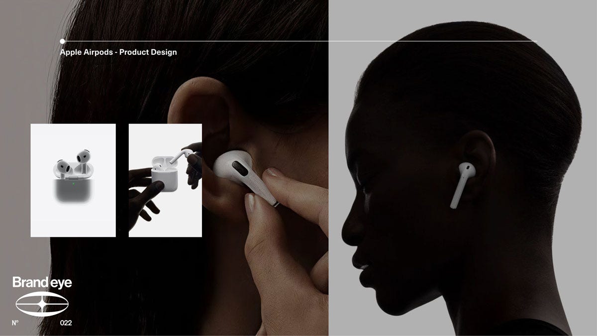
First of all, they generated no goodwill, because nobody is grateful for something that arrives as part of the packaging. Second, they couldn’t be priced properly, because Apple had already told everyone they were worth nothing by giving them away, so any attempt to charge for a replacement pair was going to look like a con. Third, there was a perception mismatch sitting right in the middle of Apple’s most personal product. Apple sells to people who consider themselves discerning, creatives and people who, in their own words ‘think different’ and yet the visible signal of owning an iPhone was a pair of earphones that read as sticking with the default. If you cared about sound, or presentation, the first thing you did was upgrade away from Apple breaking out of the ecosystem and hurting their brand. They were losing reputationally and financially at the same time, and the leak was widening every year.
That’s the trio of challenges that they had to solve with the AirPods, and every design decision made for the iconic earbuds maps onto one of them. Cutting the cable made it obvious this was a new product, not a revision. The W1 chip justified the price, and the instant pairing it enabled gave people a reason to prefer them over the cheaper alternatives that were already on the market. Then there’s the stem, longer than it strictly needs to be, signature Apple accessory white and sits on the side of your face where other people can see it. The thing that used to be crumpled in a pocket or at the bottom of a purse became a fashion accessory, conspicuous consumption from a semi-disposable giveaway.
A product Apple used to give away for free is now estimated to bring in around $18 billion a year, with close to 550 million units shipped. That’s roughly one SpaceX worth of turnover in 2025, from an object that started life as packaging.
The argument can be about ownership
So it’s all just premiumisation? Not at all. And no product proves that better than the cristal.
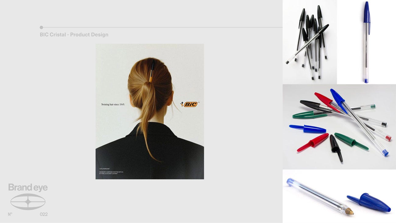
Before 1950 a pen was a possession. Fountain pens leaked, needed maintaining, and cost enough that you kept track of where yours was. Which meant that the thing you needed constantly, all day, in every room, was also a thing you owned exactly one of and kept at your desk. There was a gap between how often people write and how available pens actually were, and the whole category was sitting on the wrong side of it.
The Cristal closed the gap by deciding a pen should be everywhere rather than owned. The hexagonal barrel borrowed its form from the pencil, which is the humbler object in the stationery drawer, not the grander one. The clear shaft let you see the ink going down. The tip was engineered well enough that the pen worked every time, which mattered more than it sounds, because the whole idea falls apart if the pen you find lying around is also the one that skips. Reliable enough to trust, common enough to always be within reach.
The consequence is that a Cristal is never far away. It’s in the bag, the drawer, the glove compartment, on the desk where you left it, so the pen you reach for is almost always this one. And because there is nothing extraneous left on the design, when you picture a pen in your head, you are picturing it. It’s managed to become the pen. Over 100 billion units sold, and a place in the permanent collection at MoMA. It launched a model that BIC would then be able to replicate for lighters and razors twenty years later, once the pen had proved the idea worked.
The pattern repeats
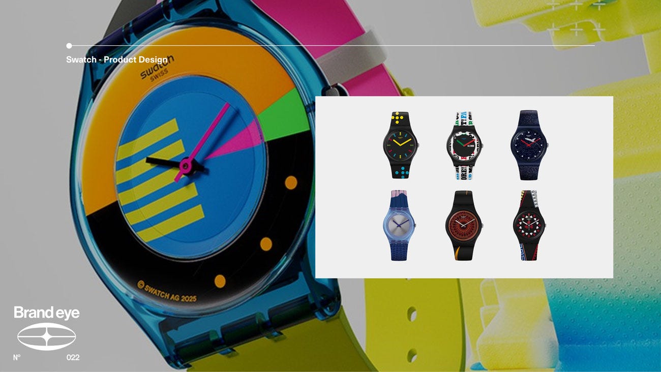
Swatch did the same thing to watchmaking in 1983. The industry was being taken apart by quartz and the instinct was to defend the positioning of watches as heirlooms, leaning into craft and heritage. Swatch’s decision to make a watch a fashion accessory instead, would prove to be a massive marketing success but it required them to build a product that made the decision impossible to misread. Scaling back the number of components, introducing a sealed plastic case, and variable colours. Nobody needed the proposition explained, because you couldn’t confuse one with a Rolex from across a room. And just like with Bic Cristal, just as with the AirPods, sales prove the success, twenty million sold in three years, a hundred million by 1991.
How this works in practice
We ran the same process with Dip at Blink Twice. Laundry is a category that has spent decades telling people it belongs under the sink, in clinical packaging, next to the bleach. Dip make detergent strips rather than pods, with safer formulations, and they could have competed on being more eco or cheaper, which would have made them a good option among many good options.
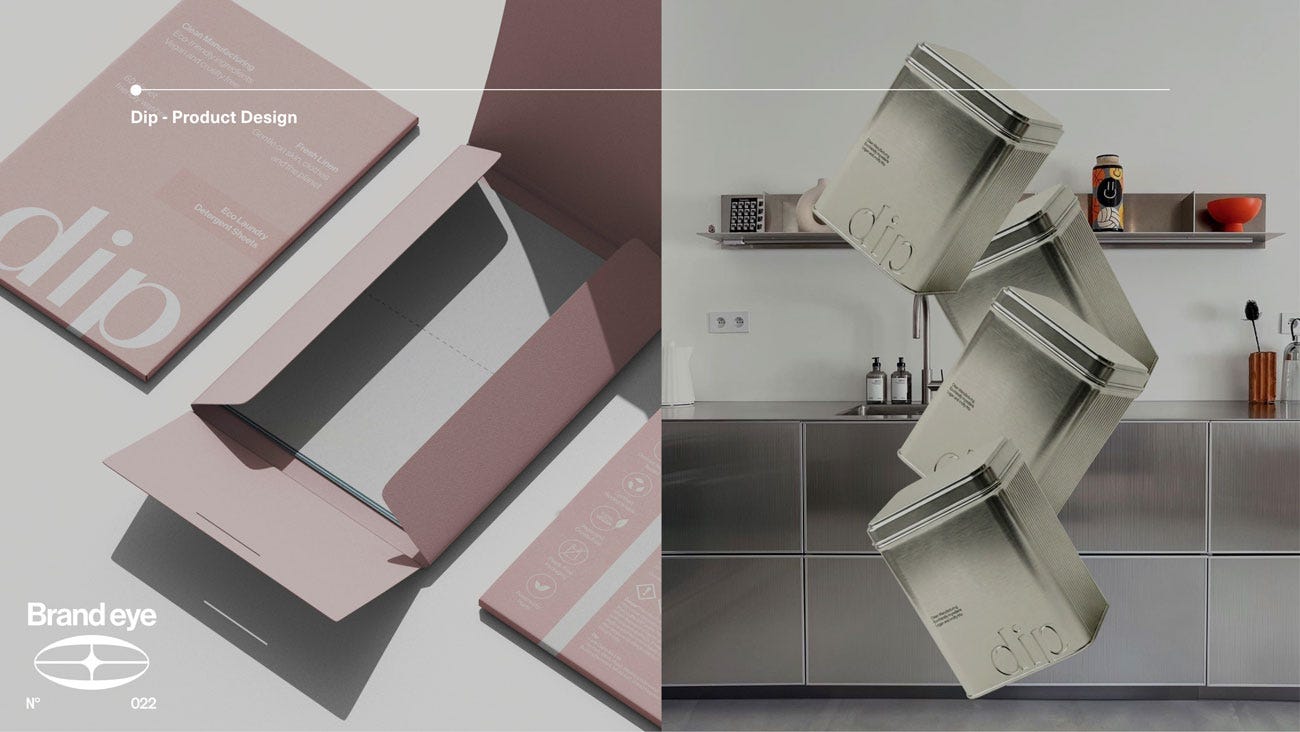
Instead we treated the category’s own perception as the thing to design against. If cleaning products are joyless because the category has always presented them that way, then the opening is to make the health of the home desirable, and to borrow codes from beauty and lifestyle rather than from cleaning. Dip became a home wellness brand rather than a laundry brand, and the product and packaging carried that argument on the shelf without needing to explain it. Revenue went from £1m to £5m inside 18 months, with sales tripling in the first month after launch.
What to take from this
The question worth asking about your own product isn’t whether it’s well designed. Almost everybody answers that one yes, and it doesn’t tell you anything.
Ask what your category has already decided about you, and then look at your product to see whether it’s agreeing. The brown bottle. The cupboard. The cable in the box. Somewhere in your category there is a convention so old that nobody in it can see it any more, and it is quietly making an argument on your behalf that you never agreed to.
Find it, and you have a product brief. Ignore it, and you’ll spend the next two years paying a marketing budget to argue with your own product.