

Setting a Course Starts With Finding Your Bearings... we call it Red Ocean Mapping
Why Your Brand Needs to Understand its Red Ocean

Why do all banks say trite things like ‘We put you first’? Why is every water bottle decorated with an alpine peak or a babbling brook? Why is every detergent sold in an opaque plastic jug in a primary colour that looks like it could just as likely contain motor oil or industrial solvent if not for the label having a picture of a smiling baby or a flower? Because all brand categories rely on invisible standards, genericisms and hackneyed tropes.
In an earlier post on Brand Eye, we laid out one of the core principles of Blink Twice’s approach to brand building, namely the concept of Blue Ocean branding. That’s the idea that a strong brand rejects those tropes in favour of a positioning that makes it one of one. This week we’re taking that theoretical approach and showing how it’s operationalized with the first step being what we’re calling Red Ocean Mapping.
What is Red Ocean Mapping?
Fairly intuitively, Red Ocean Mapping is about mapping the contours of the Red Ocean your brand sits in, that is to say – a crowded category with a heavy presence of tropes, cliches or stereotypes. This mapping process involves looking at the other brands in your category and breaking them down to find out what parts of their messaging, aesthetic or product design are tropes within the category. Patterns that are repeated, whether consciously or not, and which have become defining for brands. The idea is that if you can find what makes everyone else the same, that’s a potent vantage point from which to start ideating about what you can do to subvert internalized cliches in a way that speaks to your brand story.
But Red Ocean Mapping is more than opposition research. It’s about understanding the landscape of your category, what are the underlying assumptions that consumers have about it. It involves understanding not just what makes a brand in that category generic, but why those generic traits appeared, are they intrinsic to the product, are they imitations of past branding successes, are they simply best practice. If you simply set out to be different without bothering to try understanding why and how others do what they do then you’re not heading for a Blue Ocean, you’re just testing boundaries for the sake of it.
Let’s Look at a Red Ocean
Maybe the best move is to show you a glimpse at this type of investigation, rather than telling you about it.
Let’s take the smartphone market. Recently we’ve mentioned the brand Nothing, a few times and for very good reason. Nothing is a spectacular example of so many principles we adhere to at Blink Twice. In particular they have a crystal clear understanding of what the Red Ocean they’re escaping is.
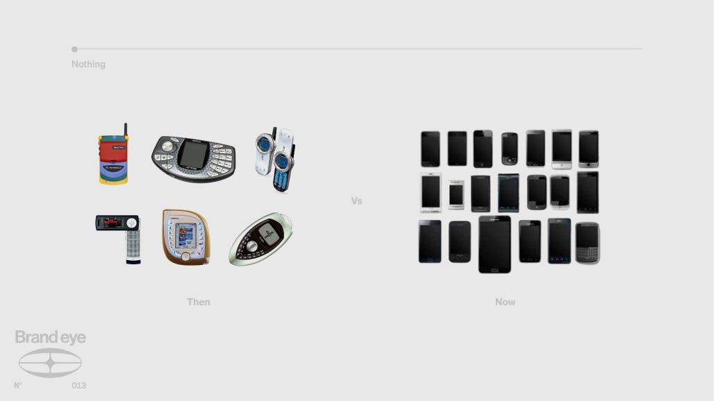
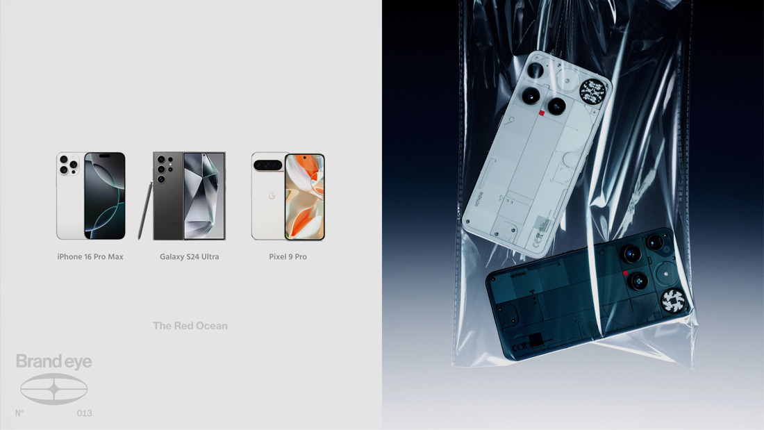
The smartphone market is dominated by certain unexamined standards and assumptions. Remember in the 2000’s with Sidekicks and Razr Phones where new groundbreaking silhouettes and layouts were the norm for cell phones? That landscape of experimentation has long since given way to a standard design philosophy that has only changed iteratively since the late 2000’s with the release of the iphone. Pick up a Galaxy phone, a Google Pixel or an iPhone, without their logos or operating systems, are you even confident you’d be able to tell them apart? This anonymous sleekness is a reflection of the deeper mechanics of these brands, Google, Samsung, Apple these are as corporate as corporate gets. Incredibly polished at the cost of any and all personality.
Nothing is, pardon the pun, nothing like its competitors. Yes the design of the phone is unique, we’ve talked before about the exposed screws and industrial design language, but its rawness in product design is matched by a similar rawness in their company’s presentation.
Nothing’s founder, Carl Pei, is unabashedly open about the work in progress nature of Nothing. Where the aforementioned tech titans are wont to discuss product updates in hyper polished keynotes, Carl Pei is more likely to sit down in an office chair in front of a camera and upload a vlog-style YouTube video talking candidly about the process of making the tech
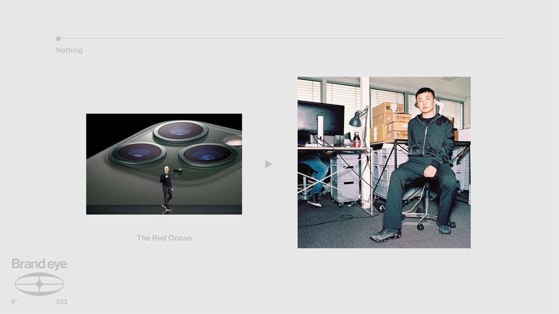
It plays with the semiotics and presentations of the world of tech-YouTubers and social media influencing to give a sense of transparency to the entire brand and its approach to design.
Carl Pei and his team understood that the brand tone of voice that existed in the world of consumer tech had become numbingly slick. There was no surface, so nothing stuck with consumers, and they also understood that this was a side-effect of the massive corporations behind the tech, not an inherent trait of tech marketing. Their unfair advantage was the very fact that they didn’t have a multi billion dollar stock valuation to think about every time they spoke.
This is why Red Ocean Mapping matters, because the amount of choices your brand could make to try and set itself apart are infinite. In order to understand which choices are actually going to resonate, and which parts of your category are not satisfying audiences’ appetites, you need to really understand the mechanics of that category in depth.
Red Ocean Mapping in the Wild
Nothing is a deep example, but the principle plays out across categories. Two quick studies in mapping a Red Ocean and using what you find to break out of it.
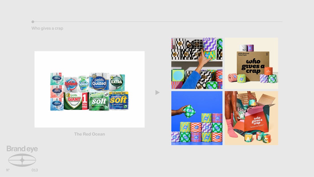
Who Gives A Crap
Red Ocean: Big Toilet Paper.
Tropes: Sterile plastic packaging. Pastel palettes. Smiling puppies. An arms race over softness and ply count.
The Insight: The category was hidden under the sink for a reason. Nothing on the shelf earned a place outside of it.
The Subversion: Bright patterned paper wrappers, an irreverent name, and 50% of profits donated to charities building toilets and improving sanitation in the developing world. A bathroom necessity became a shelf-worthy design object.
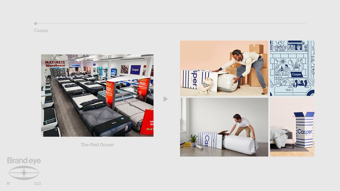
Casper
Red Ocean: Legacy mattress showrooms.
Tropes: Confusing model names. Commission salespeople. Awkward public testing. Opaque pricing.
The Insight: Buying a mattress was an exhausting ritual nobody enjoyed.
The Subversion: One mattress. One price. Delivered in a box. A 100-night trial that scrapped the showroom entirely. The unboxing itself became the brand moment.
Different categories, same discipline. Both brands looked hard at what their competitors had quietly accepted as standard, and then refused to play.
Do You Need Red Ocean Mapping?
Understanding whether or not the particular strategy of Blue Ocean branding and, consequently, Red Ocean Mapping are what your brand needs to orient its overarching brand strategy is actually fairly simple.
Ask yourself the following questions.
Do your sales rely on price or relationships or brand pull?
Can you explain what makes you different without listing features?
Could your logo sit on a competitor’s packaging?
Could your campaign ideas and content swap with theirs?
Do your type, colours, and tone of voice blend into the category?
These are simple ways of figuring out both the strength and distinctiveness of your brand profile. If you find that the answers aren’t the ones you want, your brand would likely benefit from differentiating itself in a way that both embraces what makes it unique, its story, and runs counter to the tropes of its red ocean. As we’ve outlined above, that means research, analysis, and a rigorous understanding of the territory you’re operating within.