

The Packaging World Cup
Eight nations. One winner.

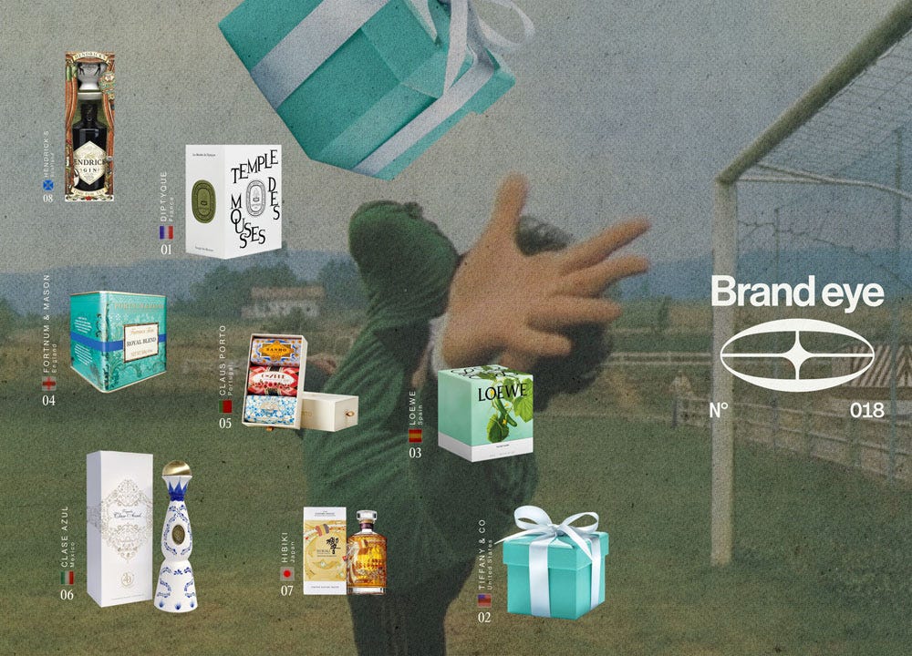
It’s world cup time! And if you’re a person who cares about business and branding, you ought be perking up just as much as the sport lovers of the world. Because this festival of football represents the largest televised spectacular in the world and both brands, and nations recognise its immense potential as a platform for branding yourself to the world.
In honour of that, we’re running a packaging world cup on instagra.com/@jackofbrands. One brand representing one country, head to head, battling it out for whose on-shelf presentation is the strongest. Will it be the big dogs of Spain with Loewe, or a scrappy underdog like Scotland with Hendrick’s gin?
We’ve made a little run-down with an argument for each contender here. Head over to Insta to get involved.
Diptyque - France 🇫🇷
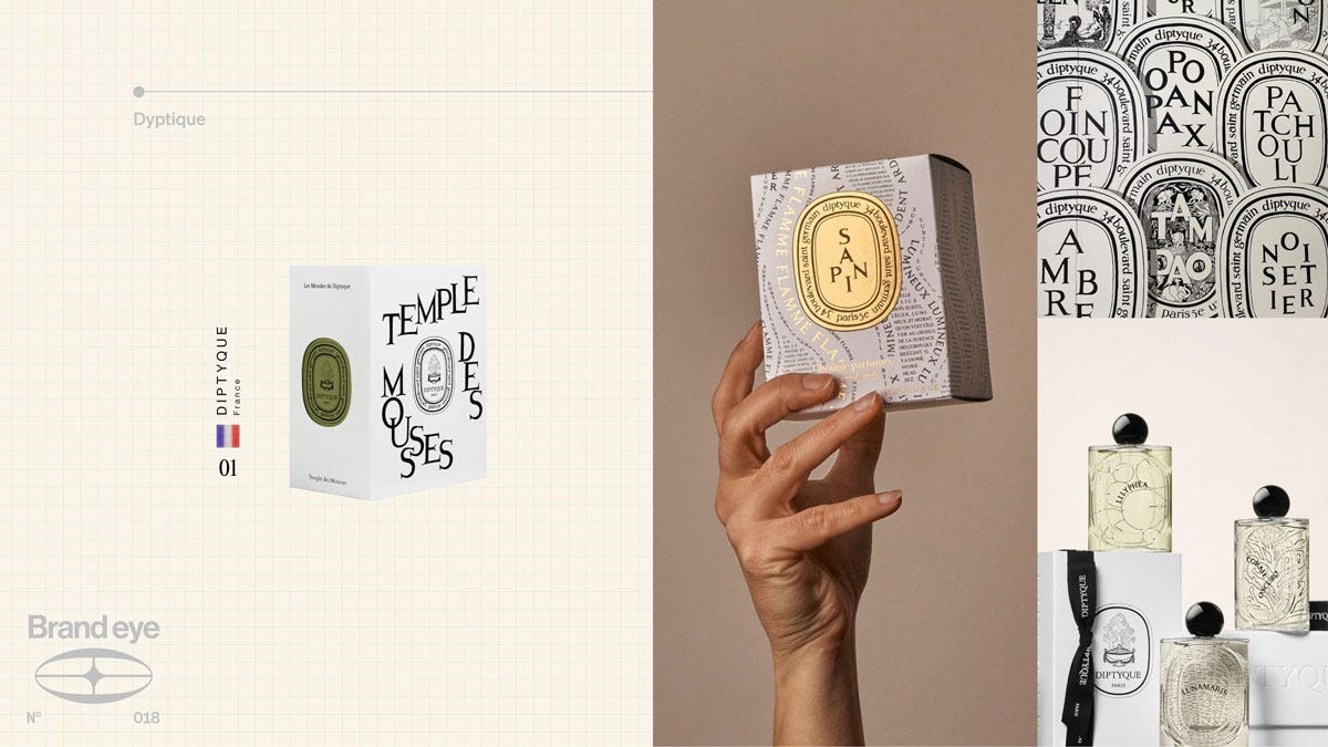
Representing Les Bleus, we’ve got the French icon Diptyque with their singature oval labels and the dancing typeface that signals its place firmly at the intersection between heritage and libertine spirit of experimentation. Just like the iconic blue of France’s jerseys echoes the legends of Platini and Henry, even when it’s worn on the back of tricky mavericks of the new generation, Diptique carries the heritage of old-world craftsmanship merged with the cosmopolitanism of Paris’ left bank.
Claus Porto - Portugal 🇵🇹
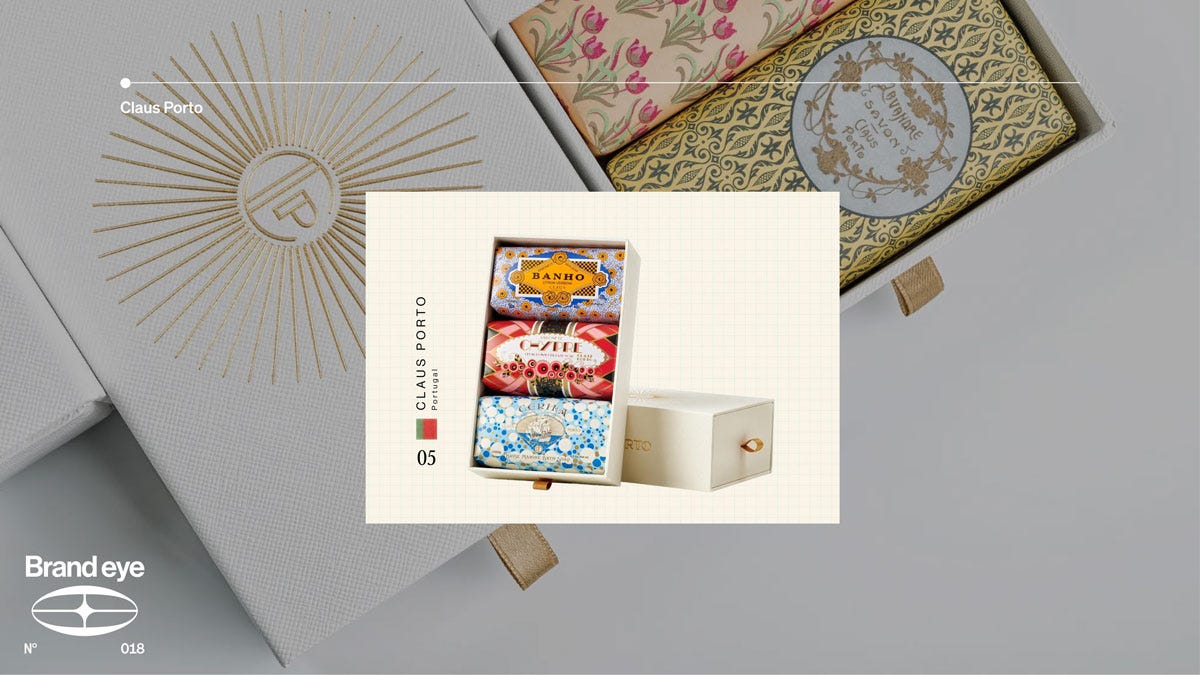
Azulejos is the name of Portugal’s iconic blue painted tiles. Elegant, delicately crafted with expertise and masterful skill but not purely ornamental, the Azulejos are practical, they’re meant to cool dwellings. Inherited from Arabic craftsment, spread to Macau to Brazil to Portugal, like the Portugese team, Azulejos represent global influence and tradition at once. Claus Porto has taken this ethos, practicality with beauty - and carried it forward to their packaging design.
Loewe - Spain 🇪🇸
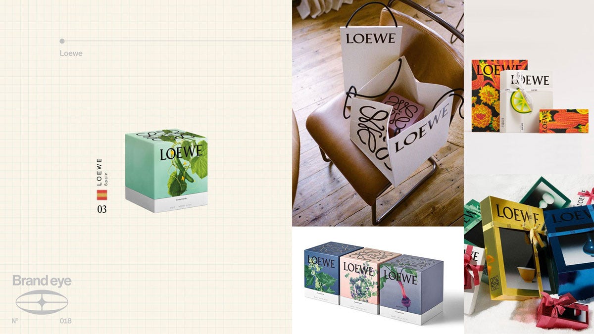
Like Spanish giants of the past have collected stacks of trophies, Loewe hardcore audiences know that a box from the fashion juggernauts deserve to sit on display like trophies in their own right. Elegant ribbons around sculptural boxes with their famous ornate sigil. But it never stands still. The packaging is a celebration of craft, constantly changing as Loewe collaborates with new designers and artists.
Fortnum & Mason - England 🏴
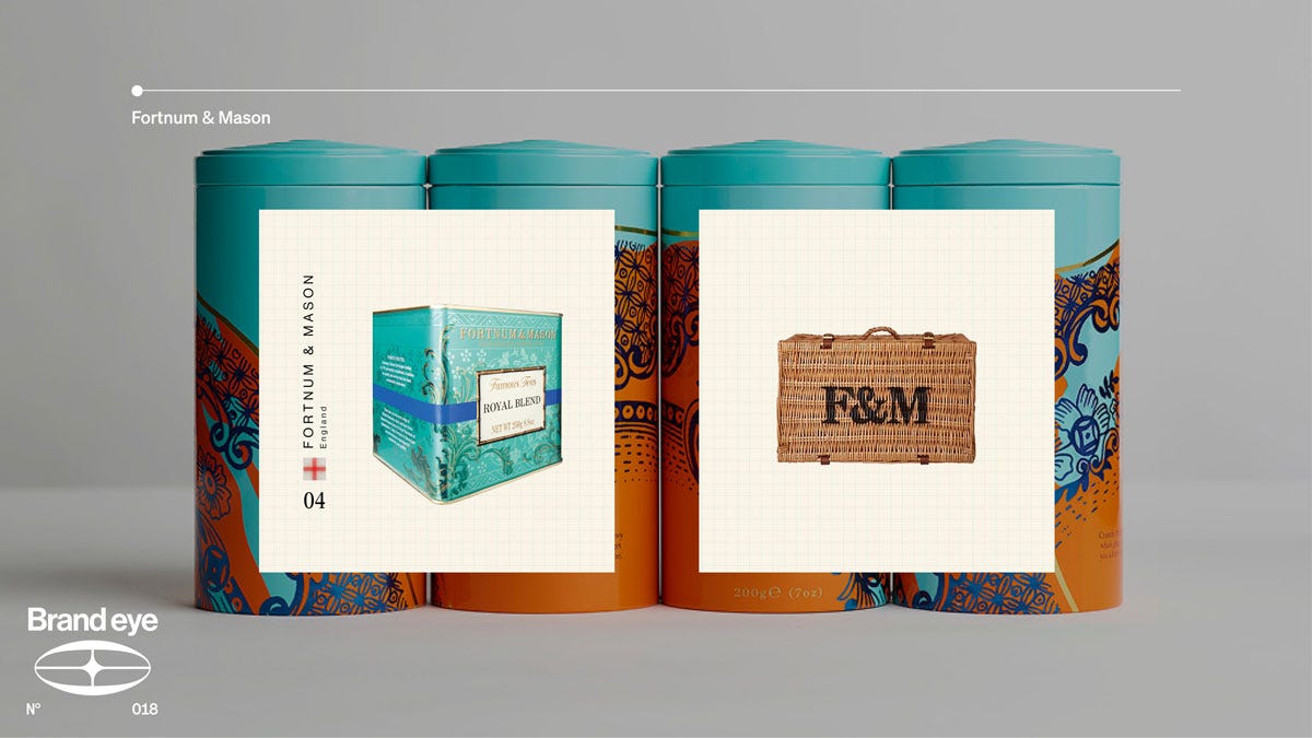
The Eau-de-Nil box and hamper are more than a symbol of the brand, and more than a way of transporting groceries - they’re reminders of the value of the finest of global food and drink. Products of the quality that Fortnum & Mason stock deserve more than your classic woven recyclable bag. If England is equal parts bulldog spirit and genteel class, Fortnum & Mason’s packaging represents the latter.
Tiffany & Co - US 🇺🇸
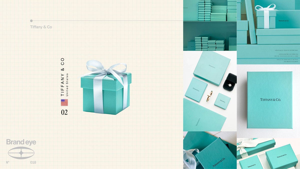
Blue box, what else is there to say. You don’t need to explain the significance of the stars and stripes, and Tiffany, representing the United States are much the same. Tiffany is synonymous with diamonds, and their signature blue is synonymous with them. It’s not no frills, but it is powerfully direct.
Clase Azul - Mexico 🇲🇽
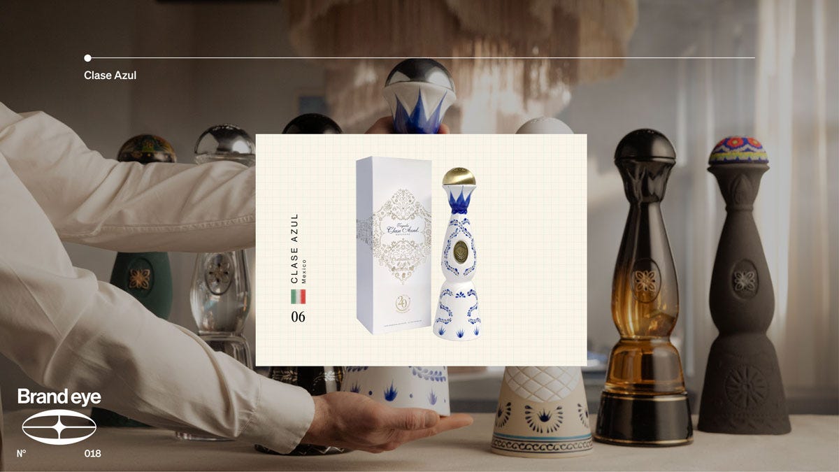
Hand painted decanters that stand out on any shelf. Embracing ebullience and demanding attention. From the handpainted designs to the bell bottle topper. This is not a piece of packaging that’s ever going to slide under the radar. Loud, classic.
Hibiki - Japan 🇯🇵
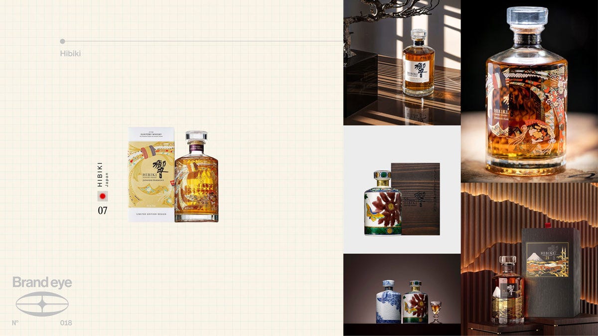
Quiet luxury is a buzzword lately, but it fits for Hibiki. Just like the Japanese national team lacks the household superstars that European and South American giants have, they’re deeply stacked with skilled players. Hibiki may not be a liquour brand that carries the heft of some, but who can claim to have a bottle that screams simple elegance and time-tried refinement like them?
Hendrick’s - Scotland 🏴
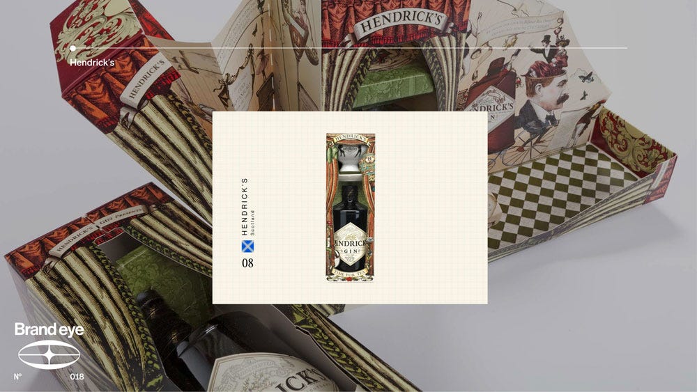
Victorian eclecticism is Hendrick’s superpower, taking the rag-tag music hall bawdiness of the gin age and outflanking the liquor industry’s addiction to cleanness by being off the wall weird. Couldn’t be a better representative for a country which marries the romance of highland culture with buckfast guzzling Glasgow club rats.