

The Real Power of a Rebrand
Strategy and identity, moving as one.

Everyone loves talking about the rebrands that fail.
Jaguar. The Gap logo. Tropicana’s redesign that lost them $30M in two months. Cracker Barrel, more recently. Shudder.
But what about the ones that completely transformed a business?
When a rebrand is backed by real strategic thinking, and executed with total commitment, it’s one of the most powerful moves a business can make.
The power isn’t a cosmeti onec. The power of a successful rebrand is its ability to reframe audiences’ conceptual categorisation of a brand in a way that works in conjunction with the business’ strategic priorities.
It’s strategy and identity moving as one.
There are broadly two types of successful rebrands. The first leans into a new strategic direction. The second reinforces and re-energises what the brand already stands for, with fresh conviction.
Both work. Both require a strategic truth and an identity system built to carry it.
Here are five rebrands that got it right.
Airbnb
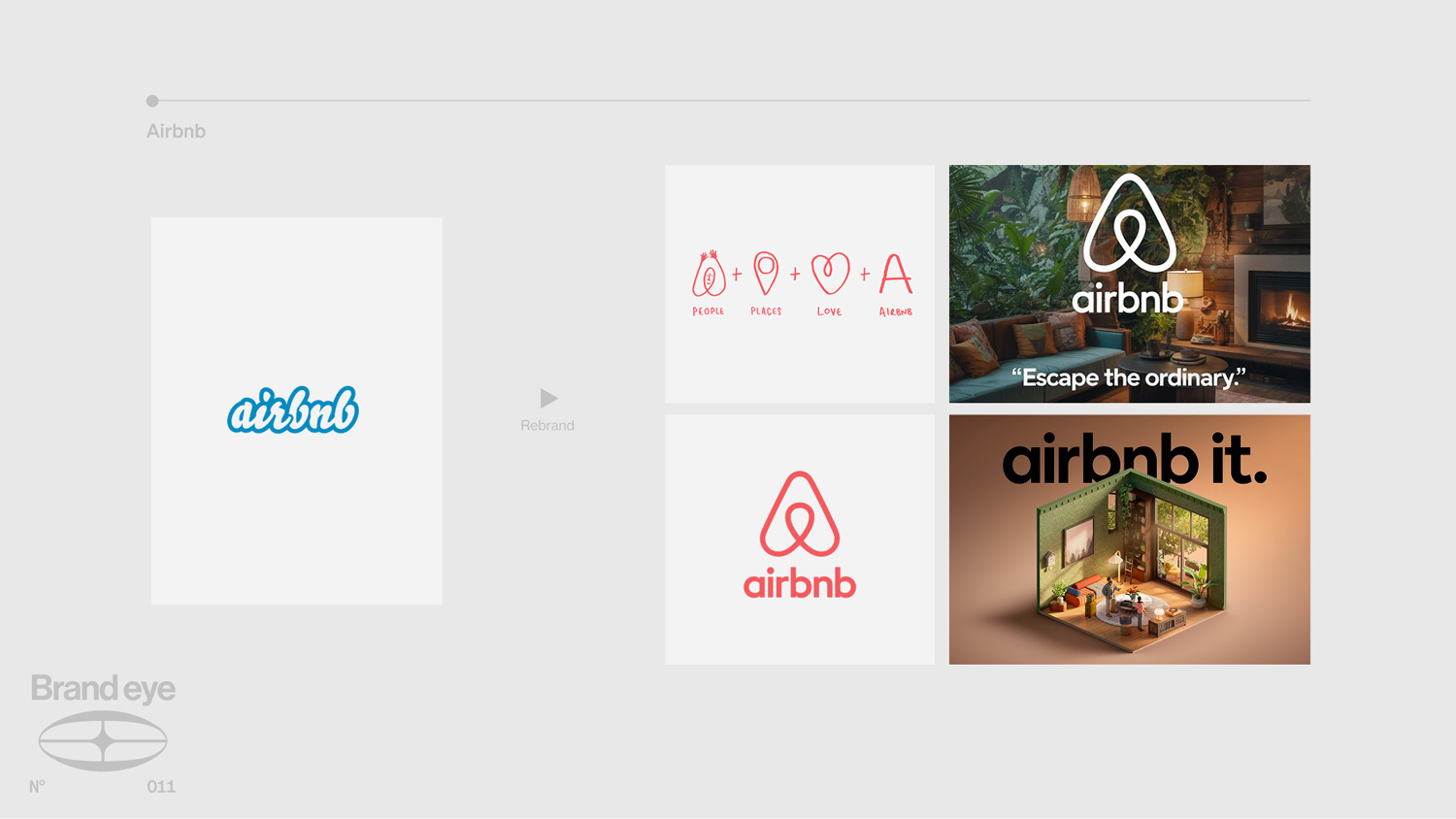
Airbnb’s 2014 rebrand is the textbook example of identity and strategy locking into each other.
Airbnb’s pitch when it was founded in 2009 was disruptive. De-centralising the hotel industry into a managed peer-to-peer network of rentals. But the technology to do something like that long predated Airbnb, as did actual platforms putting that tech to use.
The true innovation of Airbnb was not tech, nor its application, but their ability to reframe short term rentals as not an acceptable cheaper substitute to hotels but a qualitatively different product. Not a budget substitute, but a richer way to travel. A way to belong anywhere.
That strategic shift is what unlocked the brand. And the identity made it real. When Airbnb leaned into this, that’s when their brand not only became distinct, but became logical.
This came along with a new logo and font, which reinforced the message, but which would never have done the trick on their own.
The Bélo symbol gave the platform a universal mark that could sit anywhere, from a Tokyo apartment to a Tuscan villa. The soft coral palette replaced cartoonish blue. The custom typeface, Circular, felt human and approachable. The photography stopped looking like real estate and started looking like travel editorial. The UX was rebuilt around hosts and guests as characters in a story as opposed to parties in a transaction.
Result: Revenue grew from $250M to $6B in six years. IPO’d at $47B.
KIA
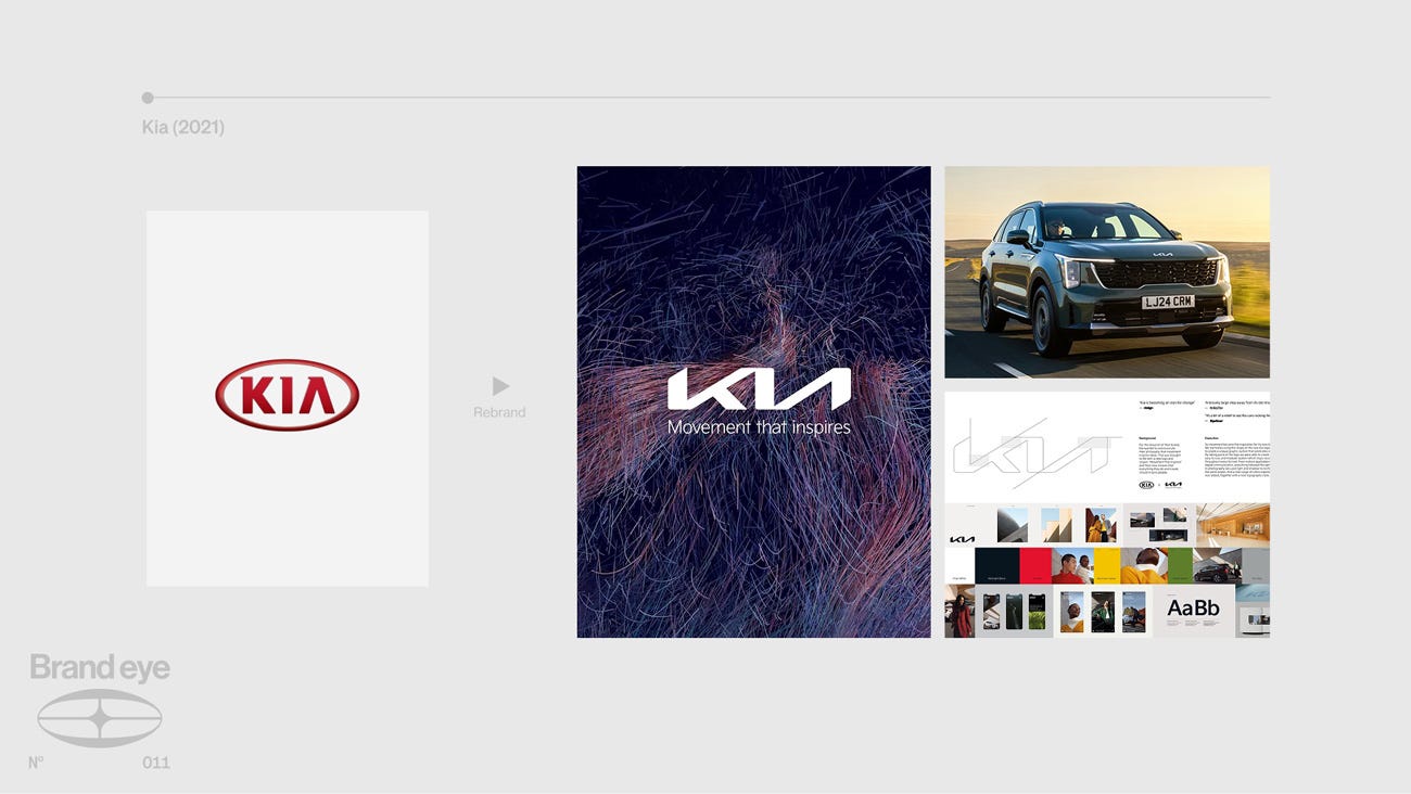
Kia’s rebrand is interesting because the old logo itself was part of the problem.
The chunky red oval with the italicised “KIA” inside didn’t just look dated, it was an anchor to a specific brand association: cheap, budget, the car you bought when you couldn’t quite afford something else. Strip the old logo, and you’re not just changing a graphic. You’re breaking the link between the wordmark and a decade of “budget car” connotations.
Which is exactly what they did. KIA’s rebrand leaned into a generational shift in the automotive industry, embracing the modernity of the brand.
Recognising that the world of automotive production was transitioning from a traditional standard of internal combustion engines into an EV dominant environment, KIA recognised that the industrial shift also presented a unique branding opportunity.
The strategic pivot was about moving from ‘automotive manufacturer’ to ‘mobility company,’ positioning Kia for an EV-dominant future where heritage mattered less than design and technology.
They changed their positioning from ‘automotive manufacturer’ stripping ‘motors’ from their name. Combined with the renaming, because the old logo was carrying so much of the old positioning, they had to replace it.
Their new wordmark was deliberately unfamiliar and forced a reintroduction. You couldn’t look at a new Kia and slot it into your existing mental model of the brand, because the mark itself broke that model. Add to that a minimalist design language across the vehicles themselves where the new angular wordmark reflected the angular design vocabular of cars like the EV6.
Result: Global sales up 20%+ post-rebrand. EV6 won European Car of the Year 2022.
Juventus Turin
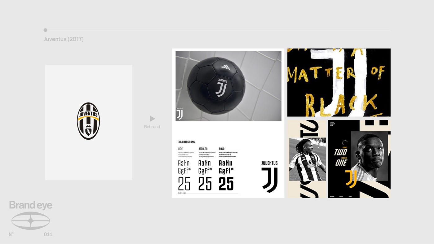
Juventus’s 2017 rebrand is probably the most controversial on this list. Fans hated it. Design Twitter(X) melted down.
The new logo had football fans fuming, but the metrics speak for themselves. A 25% increase in the value of their brand. Because the strategy behind it made sense.
Red Bull had already proven that a football club and a lifestyle brand could live in the same brand world by doing the same in reverse. Juve’s differentiating factor was basing their brand world not around ‘extreme’ culture like Red Bull but around northern Italian prestige.
It’s origins in Turin, Italy’s first capital and a city deeply assosciated with aristocracy, wealth and class, the Agnelli family’s industrial pedigree, and the club’s “quiet luxury” reputation gave them something no other football club had: a credible claim on fashion, design and northern Italian prestige.
They siezed the opportunity that appeared at the confluence of their own history with industry trends in sports and in fashion. The results?
A new logo which turned the J initial into a shield shape and made Juventus look closer to Chanel or Nike than to other football clubs. The kits moved into sage greens and pink pastels that looked more like fashion drops than regular football kits. Juve blurred the line between a matchday kit and a fashion piece. They invited Italian artists to reinterpret the logo in their own artstyles.
Juventus’ rebrand is a showcase of the fact that sometimes expanding a brand world will face pushback from legacy audiences, but that it’s a tradeoff for expanding into new sectors and doesn’t necessarily have to clash with your core principles as a brand.
Whilst this rebrand worked for Juventus due to the strategic landscape in which it was designed, I believe in general most football benefit from their heritage.
Result: Commercial revenue up 12% year on year. Merchandise sales spiked globally. Brand value up an estimated 25%.
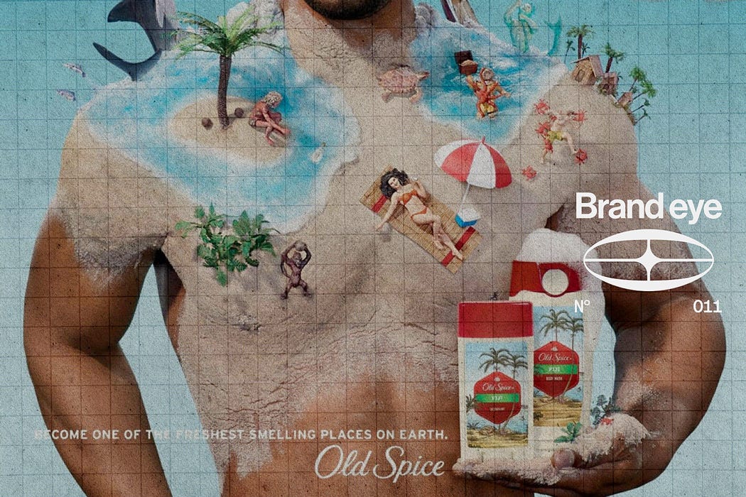
Burger King
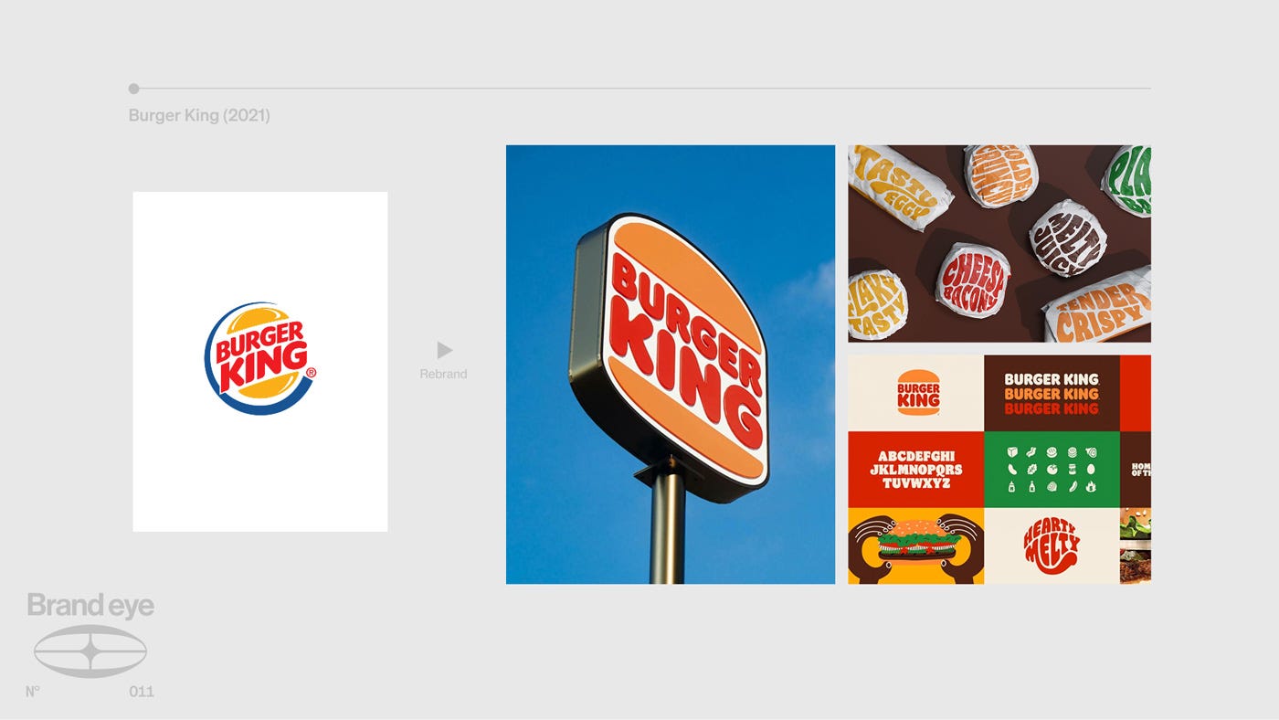
Burger King, unlike the previous three examples, didn’t use their rebrand to strike out into a new world, but to double-down and reinforce their original selling point.
After years of chasing McDonald’s into modernity to become slicker and more corporate, BK changed course. Their previous logo with a blue ring around it said “we’re a serious global fast food business” emphasis on global, fast and business, not the food.
Then, in 2021 they hard pivoted with a return to their 1969 logo. A flat, confident orange bun containing the words “BURGER KING” in a rounded, chewy custom typeface. Nostalgic, classic and simple.
Global supply chains, real estate and franchise contracts that are bulletproof, these things are surely good for business, but they’re not good foundations for a consumer oriented food brand. The old logo, and the design system it belonged to, had been carrying a message that wasn’t about being a super-modern company, but about making tasty food.
Result: Brand perception scores jumped. Outperformed every major competitor on social engagement post-launch.
Dip
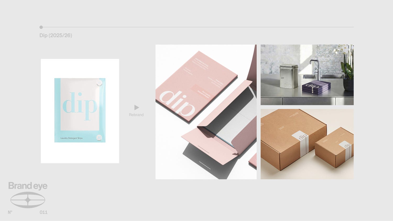
The last one is a rebrand we developed ourselves at Blink Twice.
Dip sell laundry and cleaning products. Laundry detergent strips instead of pods. Safer formulations. A category that has historically been defined by two options: clinical (think Tide, Persil) or greenwashed eco (think Ecover, Method). Both forgettable, neither earns a prominent spot in your home.
The strategic unlock was recognising that the real competitor set wasn’t other cleaning brands. It was wellness and beauty. The codes of the self-care economy allowed Dip to use a whole different set of values and principles to sell their product.
People had been taught by Glossier, The Ordinary and the whole clean living movement to care what ingredients were in their moisturiser. But nobody had connected that instinct to what they put on their clothes and surfaces.
So we built Dip as the first true home wellness brand.
A refreshed logotype built on the act of the “dip” itself, visual and literal at the same time. Sky-inspired product photography that drew on fragrance campaigns instead of cleaning aisle shots used visuals to reposition Dip’s product in a different category by using their design principles and tropes. Calm, confident colour and honest design.
Result: £1m to £5m in 18 months. Sales tripled in the first month post-launch. Now the fastest-growing laundry strips brand in the UK. The full story is here.
Rebranding Is About Strategy, Not Just Logos
What all of these rebrands have in common is that they marry opportunity, strategy and design. The design changes reflect the intention of the strategy shift which in turn is in response to a market opportunity.
Airbnb's Bélo only means "belong anywhere" because the product, photography and tone of voice all back it up. Kia's new wordmark only reads as "design-led mobility brand" because the EV6 arrived to prove it. Juventus's J only reads as "global lifestyle brand" because the kits and collaborations built a world around it. Burger King's 1969 logo only lands as "craveable" because the whole system treats the food as the hero. Dip only unlocks "home wellness" because the category pivot was baked into the strategy.
Every single one of these shows the same thing. When a rebrand is backed by real strategic thinking (and executed with total commitment) it's one of the most powerful moves a business can make.