



When we talk about brands ‘rebranding’ we’re usually grouping together two different concepts. For this reason, founders often find themselves making the expensive mistake of confusing one for the other and rebranding when they really need to be refreshing their brand or vice versa.
Knowing what you want and need is important here, because the best talent in the world won’t get your brand to where it needs to be if they’re not briefed on the right project. If you don’t have a good conception of what you need then you can’t efficiently allocate resources towards that goal.
Definitions
Rebrand: A rebrand is a fundamental repositioning of your brand, changing its meaning. Think of this as a renovation where you’re gutting the house to the studs, and changing the whole architectural style. In a rebrand the message you’re trying to send to audiences with your brand is fundamentally altered.
Refresh: A refresh on the other hand keeps the meaning and sharpens the execution. It’s finding new ways to strengthen existing positioning, same meaning with new signifiers. You realign with your core story and modernise the craft. The message you’re trying to send about your brand is the same, but it’s articulated differently to cut through to audiences more efficiently. It’s about how you’re telling people what you’re about, not what you’re telling them.
A refresh returns you to a position. A rebrand changes it.
Examples
But as always, these things typically make more sense when they’re actually put in play, so here are some examples of companies who have historically embraced either the rebrand or refresh to successful effect, why and how.
Refresh 1: Mastercard (2019)
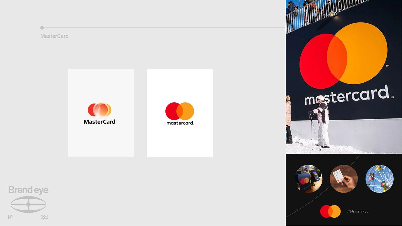
Mastercard refreshed their brand in 2019 with a minimalist logo that was still clearly recognisable, and dropped the company name. The result was an even more iconic visual cue which also signals that the brand trusts its recognition enough to let two simple shapes speak for their brand. And for a financial and payments company that confidence and trust is central. Same premise but a stronger way of communicating the message.
For Mastercard, a rebrand would’ve been both risky and potentially unnecessary. A core value proposition of a credit card company is that it’s accepted everywhere, this level of penetration and recognition is something Mastercard has been working towards building up for decades, and confusing people by targeting a radically new positioning is potentially damaging to the core value of their brand. Trust, reliability, universality. The refresh kept these principles intact and only tried to elevate the way they were being transmitted to audiences.
Refresh 2: Burberry (2023)
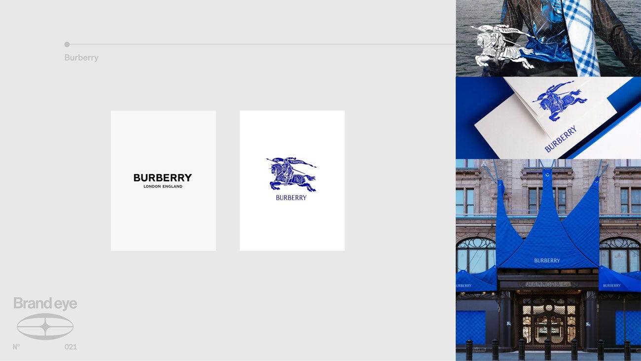
Burberry ran the same play in 2023, but by restoring rather than stripping back. Years of minimalist sans serif branding had left the house looking like every other luxury label, so they brought back the Equestrian Knight and committed to a signature electric blue across every touchpoint. Nothing about the meaning changed. British heritage, craft, the trench. The refresh simply put the brand back in touch with a story it had quietly stopped telling. That’s the other job a refresh can do. Not just sharpening your position, but reclaiming one you already own.
Rebrand 1: Airbnb (2014)
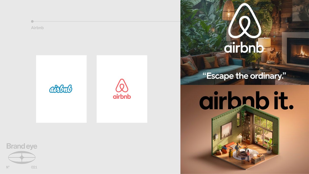
From a website for listing rentals to a ‘new way to travel’, Airbnb’s 2014 rebrand leveraged the decentralised and individualised style of their accommodations to reframe Airbnb as a way for travellers to ‘feel like locals’ by using short term rentals over standardised hotel chains. Logo change, font change but the central change was the value proposition underneath.
The product is essentially the same, a tech platform for connecting guests to hosts. But the positioning is fundamentally different. It’s no longer just that they could help you get in touch effectively and reliably with a host, they were offering you a way of travelling that was fundamentally different and more authentic than the hotel experience.
This came with a cosmetic upgrade as well, the new font, the soft coral colouring and their isometric home model advertising is instantly recognisable. Refresh and Rebrand do overlap in this sense, typically to land a reposition in the market, a cosmetic change is necessary on top, but this does not go the other way around.
The results for Airbnb were particularly sensational with a valuation that went through the roof and a truly enormous IPO, they didn’t just position themselves as one of the big tech companies, they fundamentally changed the industry in which they operated.
Rebrand 2: KIA (2021)
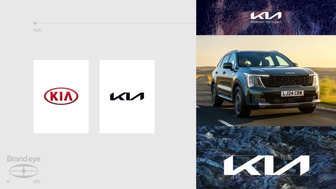
KIA’s 2021 rebrand shows the same logic from a different starting point. The old red oval was an anchor to one association, the budget car, and with the industry shifting towards EVs the position itself no longer fit where the company was going. So KIA changed the meaning. They dropped ‘Motors’ from the name, repositioned from carmaker to mobility company and replaced the logo with a wordmark deliberately unfamiliar enough to force a reintroduction. You couldn’t look at a new KIA and slot it into your existing mental model of the brand, because the mark itself broke that model. New meaning, new trajectory, and an identity rebuilt to carry it there.
Which One Should You Use?
So based on these examples, the rebrand/refresh split should be evident but what we haven’t covered is the operationalisation of it all. How do you do the work of figuring out which one you need? First of all, ask whether your brand has drifted or the market has moved. This will help you figure out if you need to refresh your brand or to rebrand yourself.
A brand which has drifted still has a compelling underlying identity but isn’t communicating it optimally. You’ve wandered off your own story, or the craft has aged, but the meaning is still right. In this case refreshing your branding is the move.
A market which has moved is a different problem. The position itself no longer fits where you’re going, so your underlying value proposition needs to change, and you rebrand to build that new meaning and carry it to audiences.
Both are routes to growth. A refresh grows by reclaiming what you already own. A rebrand grows by taking ground you don’t. The expensive mistake is confusing one for the other.
This is the sort of work that forms the foundation of what we do at Blink Twice, understanding exactly what the relationship is between your brand and the market you’re in in order to provide you with the strategy you need to elevate your branding. Not just fresh designs but an integrated strategy. Check out our previous work on BlinkTwice.studio or get in touch here if you want to chat to us more about the work we’ve done in the past, and the work we can do for you going forward.