

You Only Get One First Impression
Packaging isn't logistics. It's your story made physical.

Packaging is one of the purest forms of brand world building there is. Every surface is a chance to tell your story and every unboxing is a chance to pull customers deeper into your world.
Little touches like the weight of the glass, the snap of a tin or the illustration you linger on in the supermarket aisle matter. Even in a world built on ecommerce, packaging is essential. After the sale it is the tactile and visual bridge between the customer and the product. Make it elegant, enticing and distinctly you, and you turn a logistical necessity into a source of pleasure. But make it bland and you signal a lack of care.
But beyond just charming customers with a first impression, the real prize is packaging which also works as an open invitation to advertise your brand world. Obsessive care across every part of its manufacture and distribution is proof-of-work. Someone thought this thing was worth that much meaning, beauty and function, and the customer feels it. Done well it pays twice because it gives people something worth sharing. And it either builds your brand world or signals your brand story.
It’s Theatre
The friction of the lid. The knot of the ribbon. To the customer these read as tokens of quality, but the third-person view matters just as much. Packing is a surface ready to carry your story, it has to speak to the customer, but there’s no reason it can’t speak much wider than that.
Striking design. A handwritten note tucked inside. It is not only about perceived value. It is about designing a reveal that makes people feel the need to film, to photograph, to share that feeling of a premium experience.
Get that right and you take a cost you were always going to pay, getting product into customers’ hands, and turn it into branding real estate. A cost becomes an asset that nudges customers into being creators and ambassadors. People grow attached to things they have vouched for. And it carries the endorsement of a real person, which beats any ad an algorithm can serve.
When packaging becomes iconic enough to post, or an unboxing becomes good enough for a reel, you multiply every conversion. Sardine tins that you want to include in the picture of a table spread which you drop in the group chat. Buyers become ambassadors and brand people want to show off is social proof of the product underneath.
Signal for Some. System for All.
Regular readers know the three pillars of brand world building. Story. Signal. System. System is the obsessive commitment to your story across every touchpoint, and since packaging is a touchpoint for every brand, packaging is always part of your system. Not leveraging it by integrating it as part of that three pillared structure is leaving money on the table. Hold the story across every surface and each one reinforces who you are.
Signal, on the other hand, goes deeper. It’s a single asset that makes your story visible one which is so rooted in your brand story it couldn’t belong to anyone else. For some brands, packaging is that asset. The right signal doesn’t just get you noticed. It also makes your story impossible to ignore.
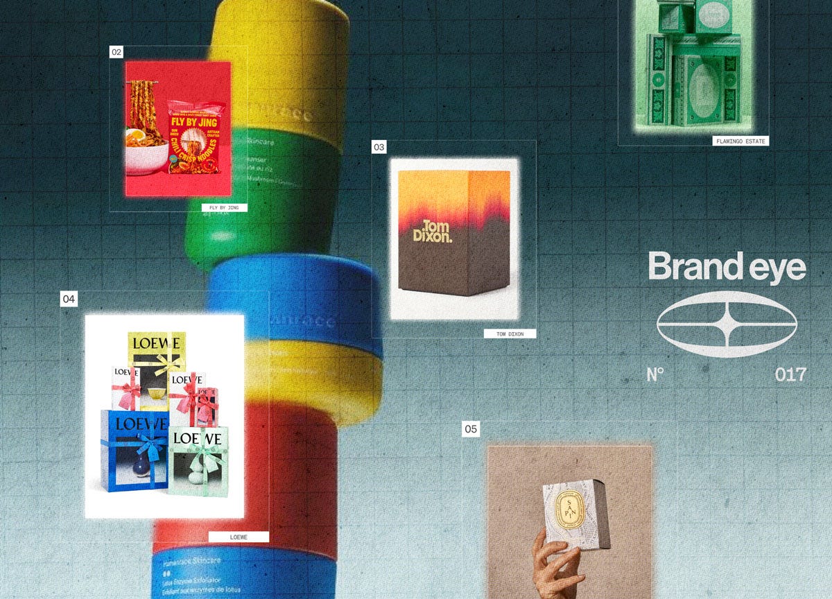
That is the lens for the five brands below. Signal for two of them, but system for every single one.
Top Examples
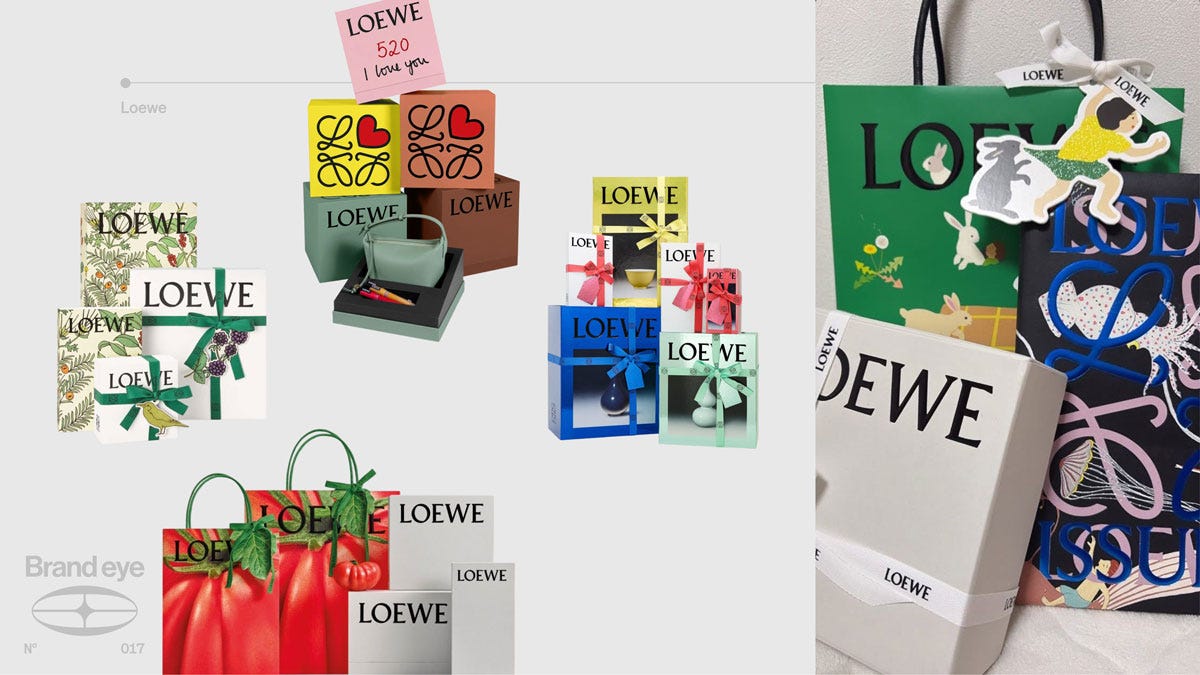
Loewe. Proof that visual identity and brand are not the same thing. Loewe reinvents its art-forward packaging release to release. The only constants are the logo and the curation. This is system. The brand is the playfulness and the high-art fluency held across everything, not a colour palette.
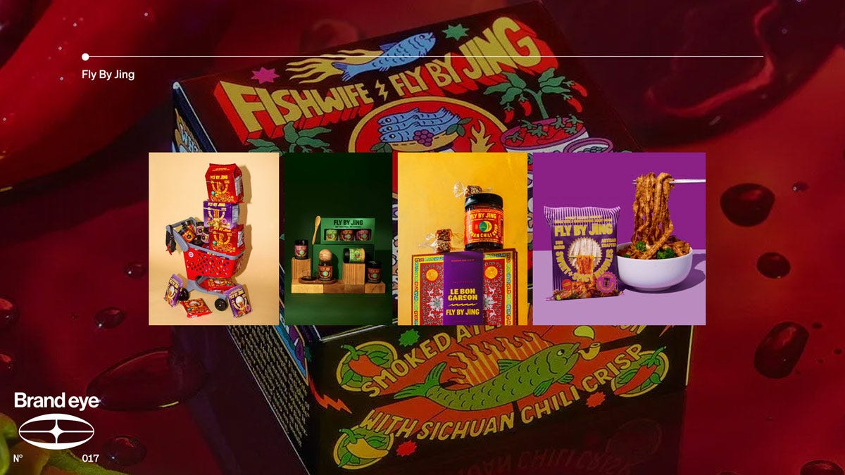
Fly By Jing. Chinese typography, bold colour, maximalist design. This is signal. The packaging is so rooted in its east-asian origins that no minimalist western competitor could lift it without contradicting itself. It demands attention, and it promises a product as bold and complex as the box.
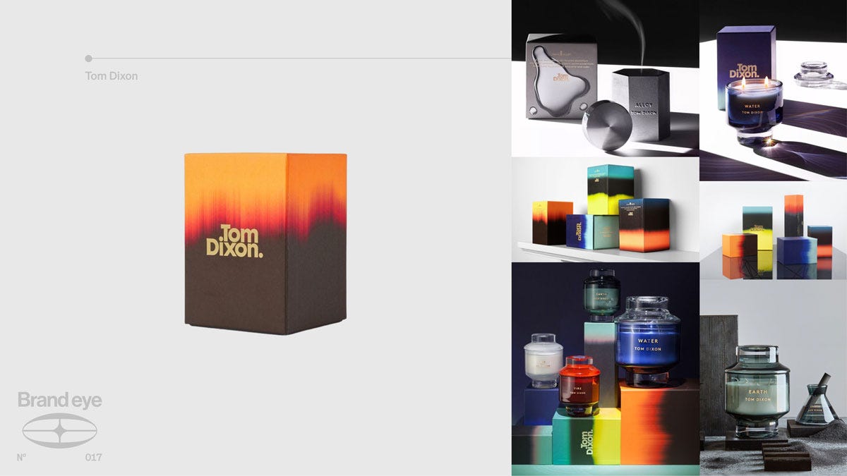
Tom Dixon. One bold idea, applied with discipline. Take a visual element from the product and put it on the box. The gradients imitate the flames. This is system. The packaging is one more touchpoint pulled into the same story the product tells, so nothing feels separate from anything else.
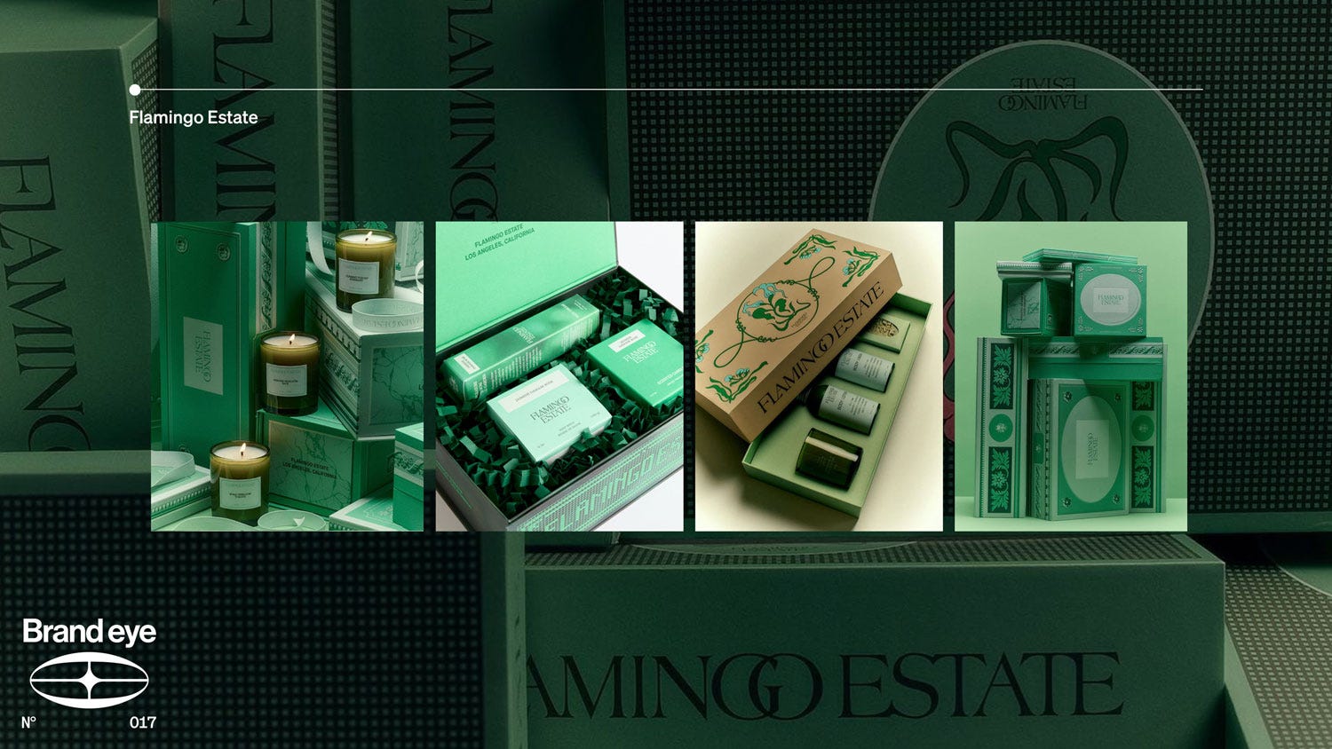
Flamingo Estate. Baroque choices across a wide range of products. This is system. What unifies them is not just the emerald green. It is the detail, held intricate and crafted across the whole range, echoing the brand’s values.
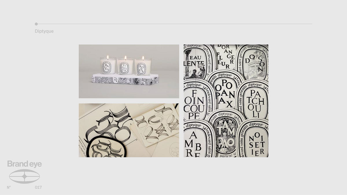
Diptyque. The oval label is not packaging. It is the signal. Sixty years of dancing letters, each fragrance given its own typographic personality, type used as a paintbrush. So rooted in Diptyque that it could not belong to anyone else. Fresh with every iteration, never drifting from the world it sits in.
The Principle, Not the Format
As the diversity of the examples above should have made obvious, the specific way you do your packaging matters far less than the principles behind it.
First, tie it to your story. Your packaging reflects who you are and what sits inside. A striking piece of packaging that contradicts the rest of your range just confuses people about your brand.
Second, shareability compounds. Packaging people want to show off, or open in front of an audience, buys you exposure you did not pay for and indeed exposure you can’t pay for, people trust peer-to-peer endorsements far more than advertising, and it’s not a fakeable asset.
Third, commit to it everywhere. Pick an aesthetic, root it in principle rather than rules about font, logo or material, and hold it across every surface. Held that way, packaging never constrains creativity. It lets you keep experimenting while every release adds to the world instead of starting it over.
That is the whole game. Packaging is a cost you were always going to pay, treat it as a necessity and it stays one. Treat it as your story on the other hand, one made physical, and the necessity becomes a billboard. Commit to that across every touchpoint and the brand becomes a world people want to enter.