

Your Creative Direction is Only as Good as Its References
Why You Need to Build Up Your Creative Reference Library

When working on anything from product design to advertising, one of the most important lessons to keep in mind is that none of it exists in a vacuum.
Regardless of how disruptive or innovative you’re being, you will always be, intentionally or not, operating within a network of artistic and cultural references.
It doesn’t even necessarily have to be about where you draw your references from. The associations formed by your work in the minds of audiences are just as, if not more, important.
A tactic that has paid incredible dividends in creative direction is building a deep repository of cultural knowledge. It lets you understand how your work might trigger associations for audiences and gives you a library to draw on.
This isn’t about copying. It’s about internalising the insights of other creatives and translating them through your own unique approach.
So let’s look at how drawing on deep, sometimes obscure, references has produced some of the most iconic pieces of creative work ever made.
Draw on Fine Art and Literature - Guinness and Moby Dick / Apple and 1984
Guinness’ 1999 ‘Surfer’ ad not only won more awards than any other piece of advertising that year it was also crowned the ‘best ad of all time’ by the Times the following year. No mean feat. So what made it so successful?
They didn’t start from scratch. The white horses rising from the waves drew on the 1873 painting “Neptune’s Horses” by Walter Crane, which itself referenced ancient Greek art. Then the voiceover invokes Ahab, drawing directly from Herman Melville’s Moby Dick, layering in the mythology of obsession, the sea and the pursuit of something greater than yourself. Guinness played off 2,000 years of art history and symbolism to make something that felt epic in the truest sense of the word.
Apple did something similar with their iconic ‘1984’ TV ad, released during the Super Bowl in January of that year. The ad depicts a dystopian society of drone-like automatons, positioning IBM as Big Brother and Apple as the force breaking through conformity. They drew directly from George Orwell’s novel of the same name, a work so embedded in our culture that everyone understands its stakes, whether or not they’ve ever read it.
Draw on Legacy Ads - IKEA and Stella Artois / Apple and Volkswagen
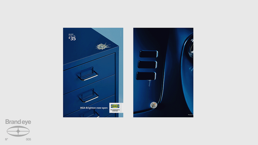
IKEA’s Brighton-specific ad, featuring their furniture covered in seagull s***, was an iconically local moment for residents of the seaside city. But it was also a direct homage to a vintage Stella Artois ad in which luxury objects doubled as bottle openers. Both global brands understood that a successful campaign should feel specific, iconic and somehow familiar all at once.
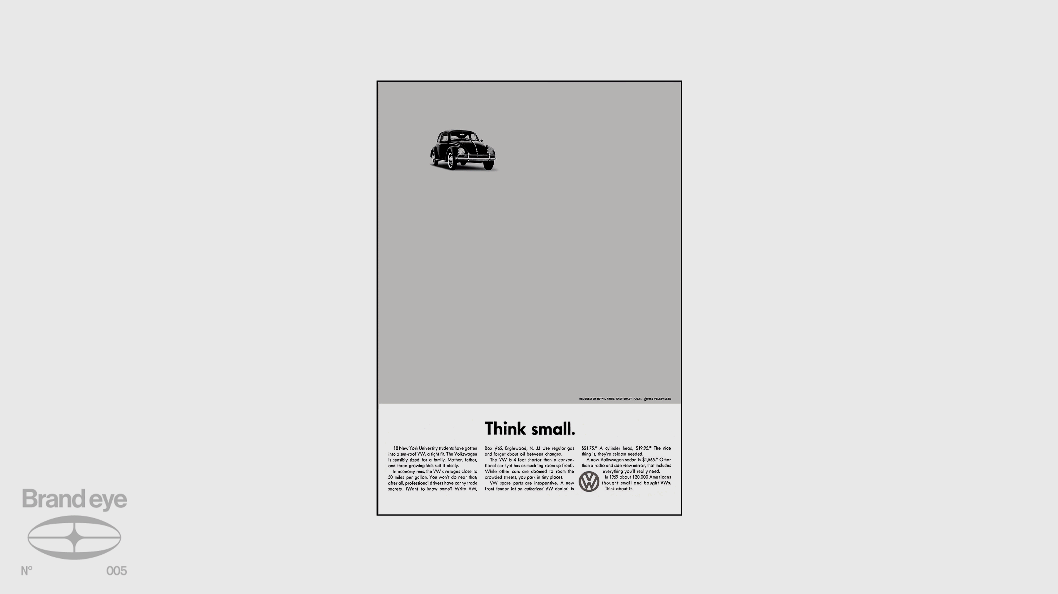
Then there’s Apple’s ‘Think Different’ campaign. Separate from the ‘1984’ Super Bowl ad, this was a poster series featuring iconic figures like Albert Einstein, Muhammad Ali and Amelia Earhart alongside the simple strapline: Think Different. That campaign drew directly from Volkswagen’s legendary ‘Think Small’ ads of the 1960s, widely regarded as one of the greatest advertising campaigns ever made. Apple didn’t just borrow the spirit. They consciously echoed the copy itself.
Draw on Pop Culture - Stranger Things and Stephen King
Pop culture represents a deep well to draw from, particularly because of the emotional connections audiences already have with it.
If you can identify a design element from a piece of popular culture and use it as shorthand, you can piggyback on the emotional resonance it carries without a single line of explanation.
This is exactly what Stranger Things did with their title sequence typography.
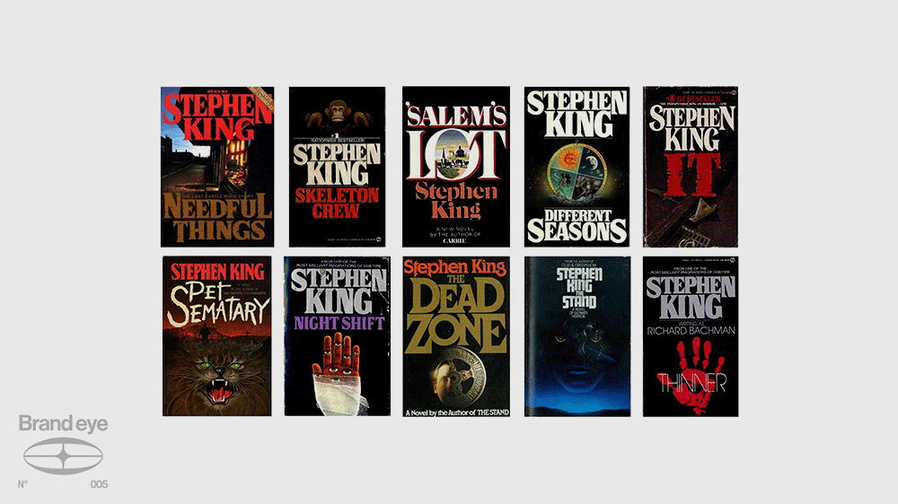
The Stranger Things logo is a direct nod to the mass market Stephen King paperbacks of the 1980s that made him a household name. Those paperbacks are less of a staple today but are so beloved they’ve become collectibles, and for an entire generation of readers they were ubiquitous.
When Stranger Things used the same enlarged first and last letters, red font and bold serif typeface, they were priming an entire generation for a supernatural mystery before a single frame of footage ran. The reference inspired the work and communicated meaning directly to the audience.
Draw on History - Burberry and Tartan
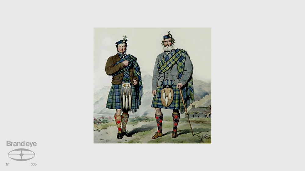
While pop culture is instantly legible to contemporary audiences, history provides a richer, if more occasionally obscure, reference point. Historical references carry a sense of heritage and status that cannot be manufactured any other way.
Burberry has made their chequered pattern so inseparable from their brand identity that you don’t need a logo to recognise one of their pieces.
When the brand first introduced the pattern in the 1920s, it was already a throwback. Inspired by highland tartan, it harkened to the highland revival, the romantic depictions of Scottish Highlanders that defined the mid-to-late 19th century. And that highland revival was itself a reference to centuries of Scottish Highland culture. Three layers of history folded into a single fabric.
Draw on Modern Art - Nike Air Max 1 and the Centre Pompidou / Supreme and Barbara Kruger
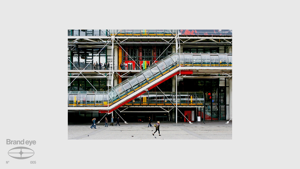
Modern art is often associated with deconstruction, subversion and protest. For brands aligned with street culture, it’s a natural fit. If you want to signal that you’re at once rebellious and forward thinking, but also cultured and aesthetically informed, reaching to modern art and architecture sends exactly that message.
When Tinker Hatfield designed the Air Max 1, he took direct inspiration from the Centre Pompidou in Paris, the building famous for wearing its mechanical infrastructure on the outside. He applied the same logic to the shoe, making the internal air unit visible. It set the template for an entire category of sneaker design.
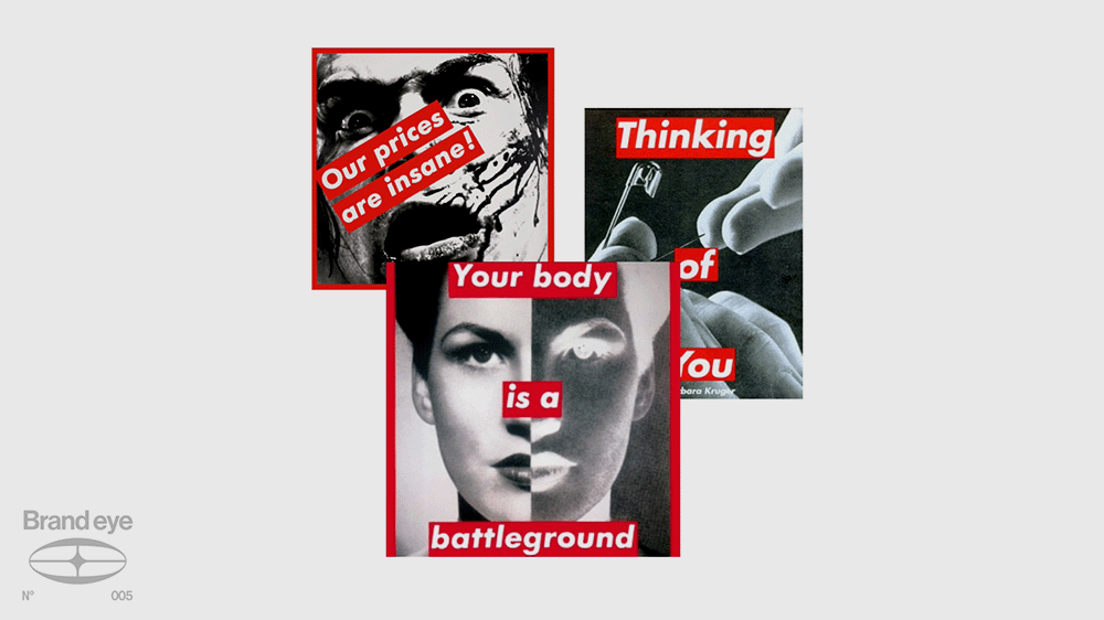
Supreme, likewise, looked to Barbara Kruger for their iconic red box logo. Kruger made work that explicitly critiqued consumerism and capitalism. She may not have been aligned with Supreme’s values, but her design vocabulary was exactly what they were after.
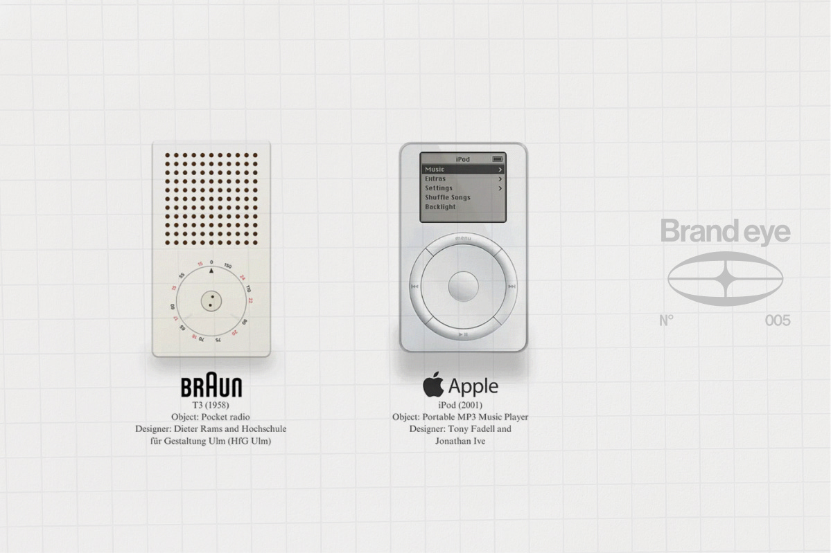
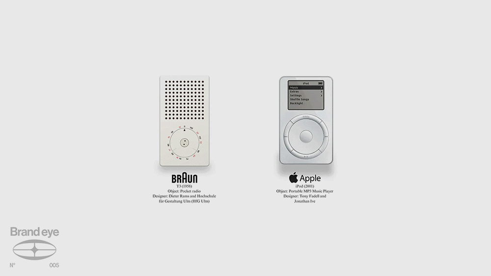
Draw on Historical Product Design - Apple and Braun/Bauhaus
You don’t even have to leave the domain of product design to find your references. Apple’s minimalist design language, developed by legendary designer Jony Ive, drew heavily from the Bauhaus school in Germany and, in particular, from products by electronics manufacturer Braun. Braun had internalised Bauhaus principles: combining artistic licence with functionality into a distinctly futuristic type of industrial design.
By the late 20th century, that aesthetic carried both heritage and forward-thinking energy simultaneously. Apple’s designers recognised it and built a product line on the back of it.
That’s the truth about creative direction. It is not about reinventing the wheel from scratch time after time. Curation is part of the job. Every great idea is built on another.
The genius isn’t in copying. It’s in how deep your references go, and how you’re able to connect those invisible dots.
So whether you’re building a brand, product or campaign: expand your references. Dig into history. Design archives. Old campaigns. Culture outside your bubble. If you get the hang of Are.na, it is a goldmine for this.
We mentioned Apple three times in this post but you’d never accuse them of being unoriginal.
So when Apple said Think Different... what they really meant was: connect the dots differently.