


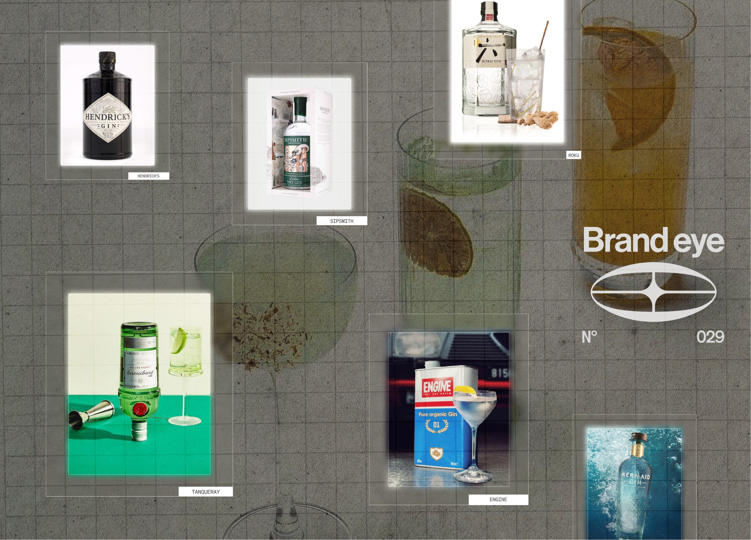
When you hear the word brand, what do you think of? Since you’re reading this Substack, presumably you think of the associations built up in the minds of audiences, the values customers want to buy into when they buy your product. In short, the thing that turns a product from a simple physical object into a ticket of admission to the story or world behind it. Ask most people, though, and they’d point at the product itself: the logo, the shape of the packaging, the colour on the shelf or, in the case of gin, the bottle.
That gap is what our new series, Brand vs. Bottle, is about. We take an iconic product and look at it twice, once as the object you can hold and once as the world around it that makes you buy it again, then ask which is doing more of the selling.
We’re starting with gin. By law every gin has to taste predominantly of juniper, so the craft is in the details: the other botanicals and how they’re distilled. You can’t taste any of that through the glass, though, so the bottle and the world behind it have to tell you about it.
Founders often see their own brands the same way: product and packaging first, story last, if at all. It’s why, at Blink Twice, we hear the same thing so often: we’ve rebranded before and nothing changed. (We’ve written about the cost of designing the product first and branding it afterwards in Brand Before You Build.)
Without further preamble, let’s dig in.
Hendrick’s
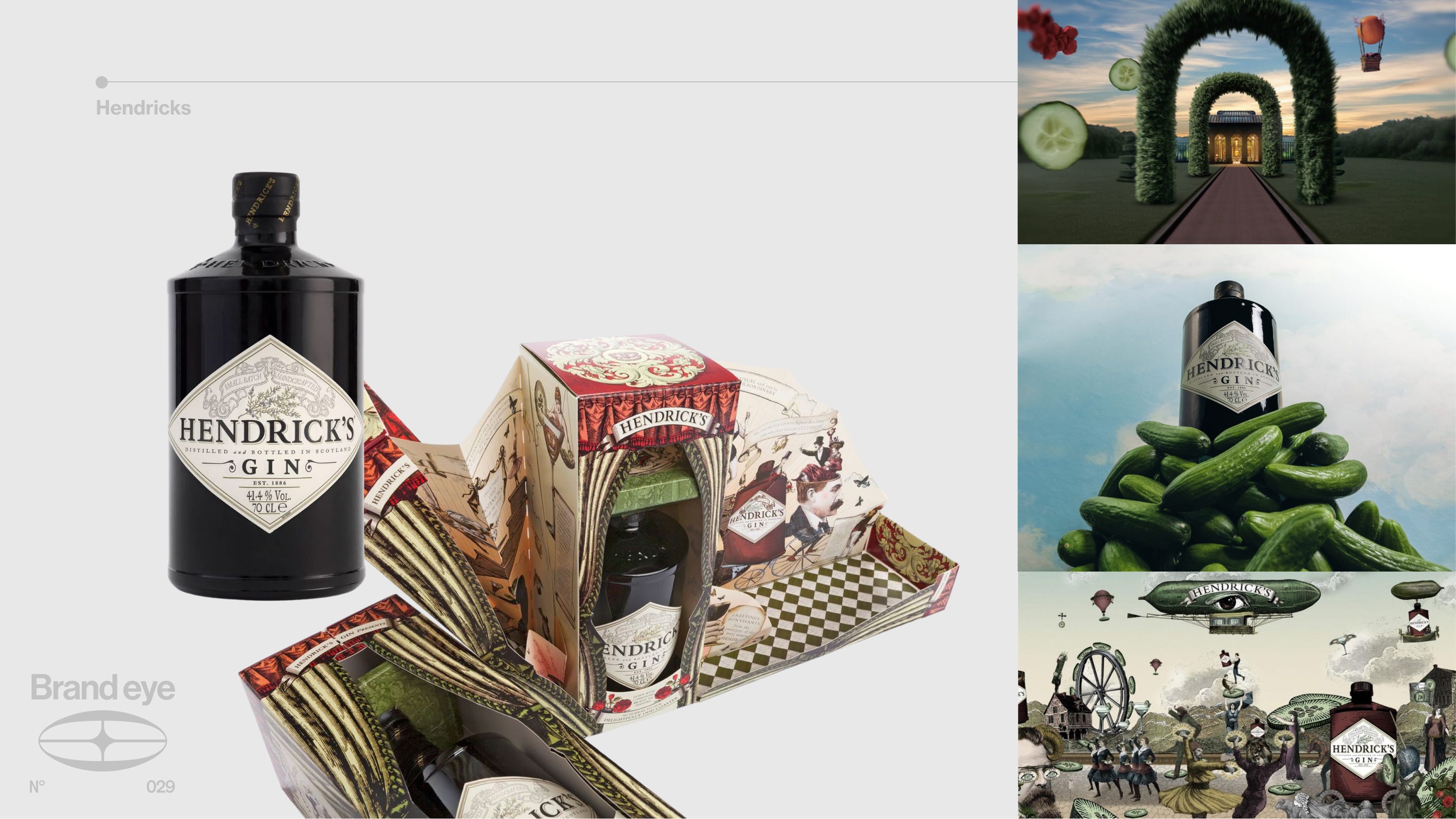
Bottle - If you have even a passing interest in gin, you probably already know what the Hendrick’s bottle looks like, and that in itself is evidence of its quality. The dark apothecary-style glass (Victorian apothecaries used it to keep precious liquids out of the sunlight) and the diamond-shaped label give off an old-fashioned-ness that ties straight into the brand story.
Brand - But the brand is where Hendrick’s truly excels. Everything is built on Victorian eccentricity, the era when gin shook off the Gin Craze and moved into gilded gin palaces, brought to life in dioramas and hand-drawn illustrations. Then there’s the cucumber, infused alongside rose as a nod to cucumber sandwiches in an English rose garden, and repeated everywhere from the serve to the ads. In our language that’s a Signal, a single asset rooted in the story and repeated so often it’s become theirs.
Outcome - An exceptional bottle, but it’s the rest of the branding that makes the product stand out. If you’ve ever rebranded and watched nothing change, Hendrick’s shows you what was missing.
Tanqueray
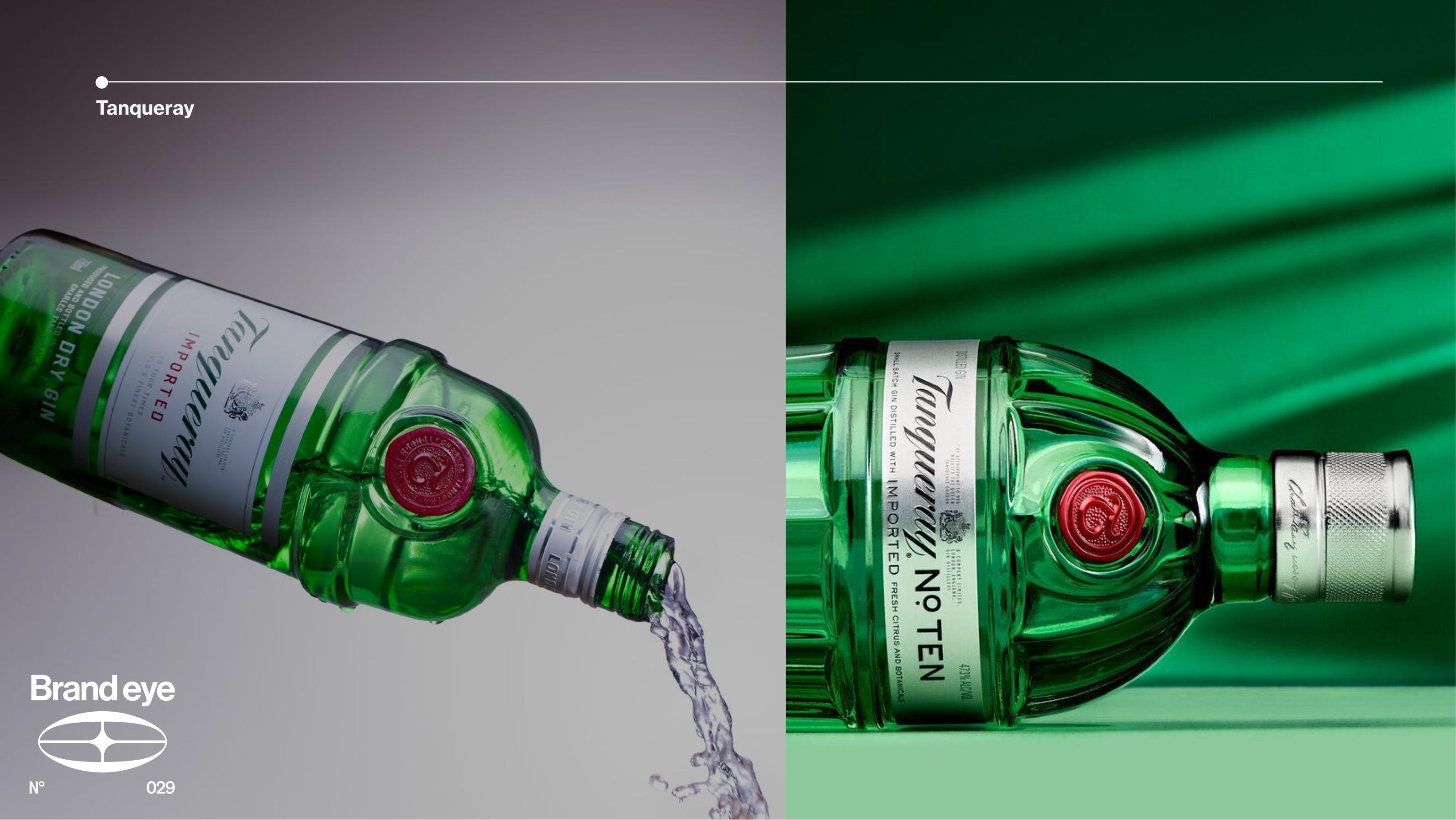
Bottle - The green glass bottle shaped after a 1920s three-part cocktail shaker, with the signature red seal. A classic.
Brand - Unlike Hendrick’s, Tanqueray doesn’t have a brand world to tie into its design. A heritage page on the website isn’t enough, especially given the raw material. The pineapple on the family crest was the ultimate symbol of hospitality in 1830s England, and it’s on every bottle. You could build a whole world on that. Instead it just sits there.
Outcome - Here it’s very much the name and by association the bottle doing the heavy lifting. Tanqueray can coast because it has nearly 200 years and Diageo behind it. Most founders don’t, and a bottle with no world behind it has to be pushed with pricier clicks and discount codes.
Sipsmith
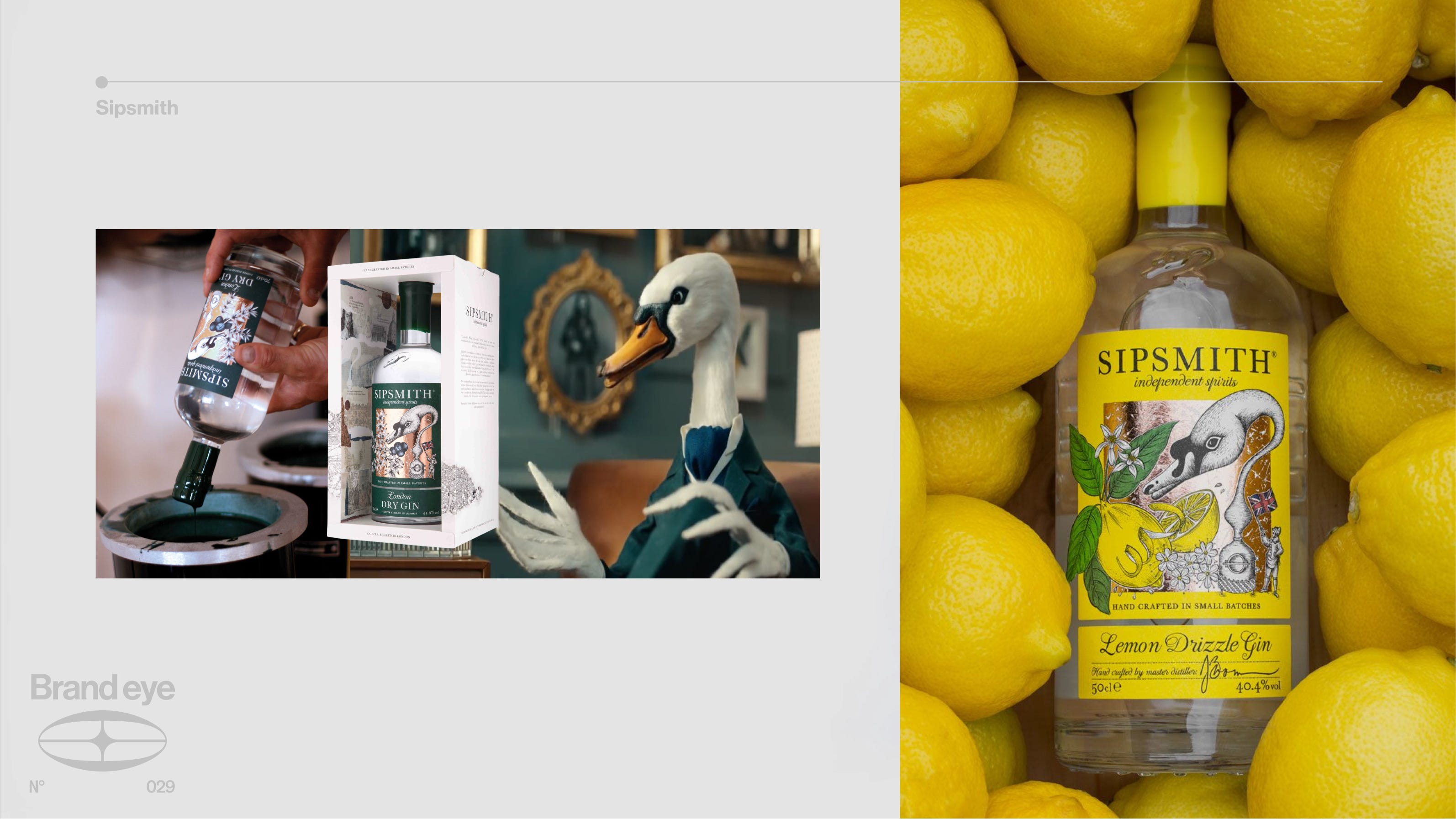
Bottle - Copper foil and a colour for every flavour make Sipsmith stand out on any shelf. The 2023 redesign added a ripple pattern on the shoulders inspired by the brand’s swan, and the label hides easter eggs from the founding story, including the scooter the founders first delivered on.
Brand - The swan comes from the swan’s-neck copper pot stills at their distillery, London’s first new copper pot distillery in nearly two centuries when it opened in 2009. It’s also their mascot, Mr Swan, star of stop-motion ads with a quaint, days-of-yore feel.
Outcome - Yes the bottle is distinct but it’s not desperate, yes the brand world is quirky but it’s not cloying. Follow the swan and you can see why bottle and brand hold together. It comes out of the stills, which is the Story, and Sipsmith has made it the Signal, on the label, in the glass and, wearing a suit, in the ads.
Roku Gin
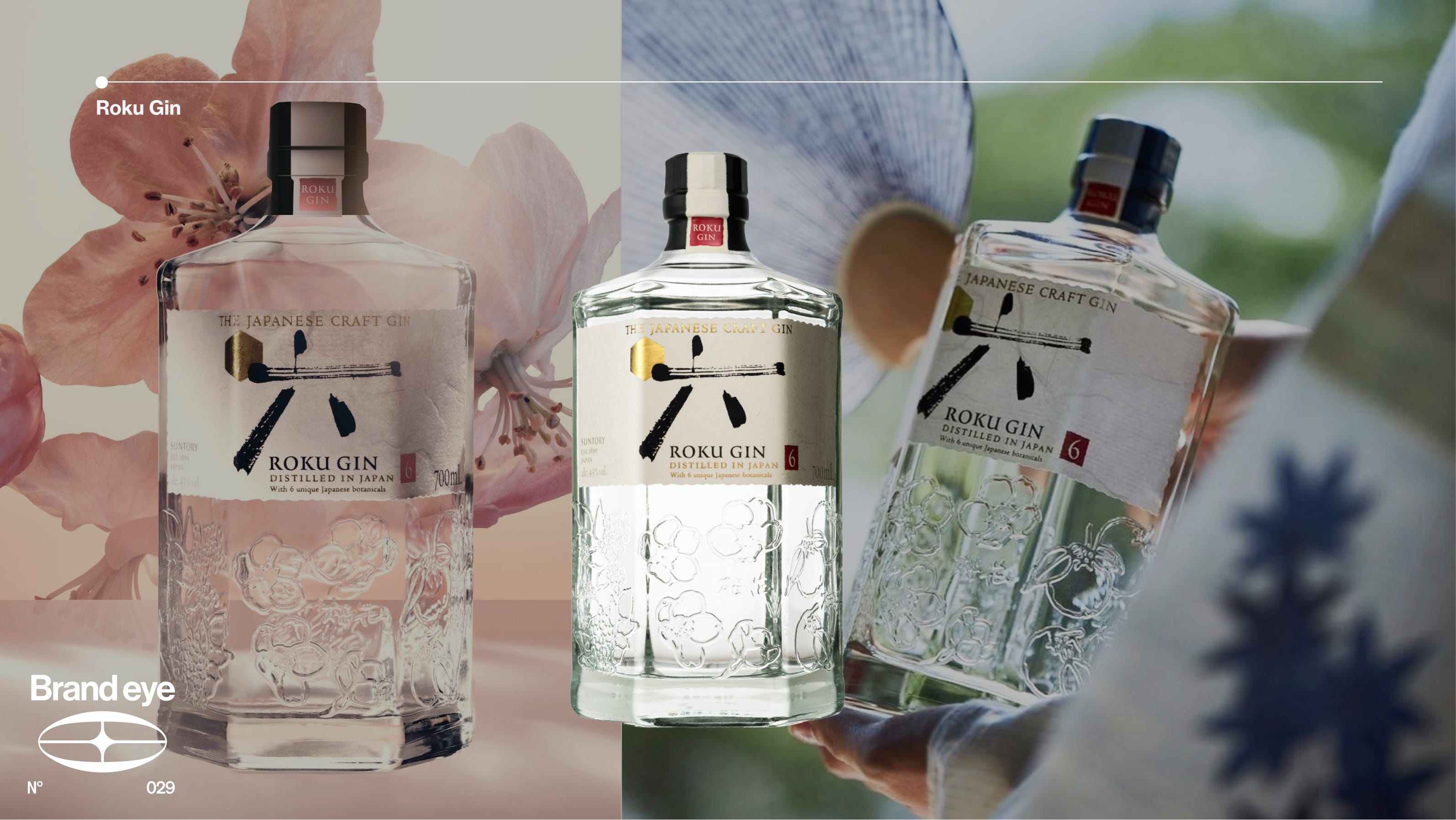
Bottle - Roku means six in Japanese, hence the hexagonal bottle (get it?), each side embossed with one of its six Japanese botanicals and finished with a washi paper label and kanji calligraphy. It exudes Japanese craftsmanship.
Brand - The drawback is that Roku leans on Suntory a bit heavily. The botanicals, from sakura to yuzu, are harvested across Japan’s four seasons, but every gin brand does botanical innovation, and the seasonality isn’t communicated once you’re past the glass. It’s a case of telling but not showing. Compare it to the cucumber in every piece of Hendrick’s marketing. Funnily enough, Sipsmith is a Suntory brand too, so this isn’t a question of resources.
Outcome - A strong bottle, but a brand that doesn’t carry it through. If you’re a founder, that might sound familiar.
Mermaid Gin
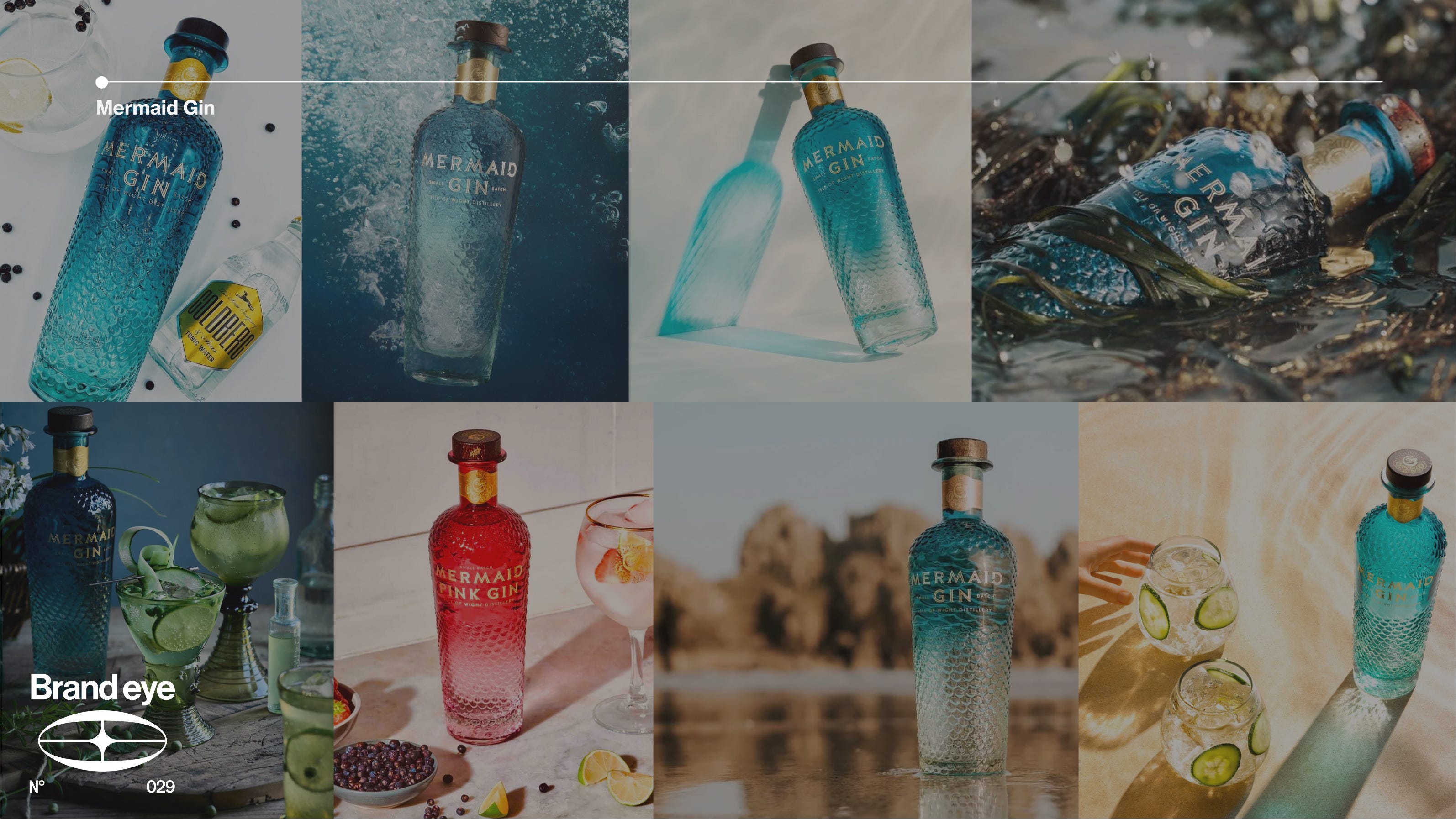
Bottle - Sculpted scales swirl down the bottle like a mermaid’s tail, in colours that run from Mediterranean blue to Atlantic green. It won the bottle design category at the IWSC the year it launched, and the distillery’s sales director calls it “the main game changer” for the brand.
Brand - Coastal gin is a crowded field (a Red Ocean, in our language) and there isn’t much aside from the bottle to make Mermaid stand out. The name comes from the rock samphire foraged on the Isle of Wight’s cliffs, known locally as Mermaid’s Kiss, and no other coastal gin can claim that. You’d likely pick this off the shelf, but are you coming back once the novelty has worn off?
Outcome - A top-tier bottle that needs a stronger world underneath it. Mermaid is the clearest case here of a bottle winning the first sale, and if customers buy once and forget you, every repeat sale has to be bought back with another ad.
Engine Gin
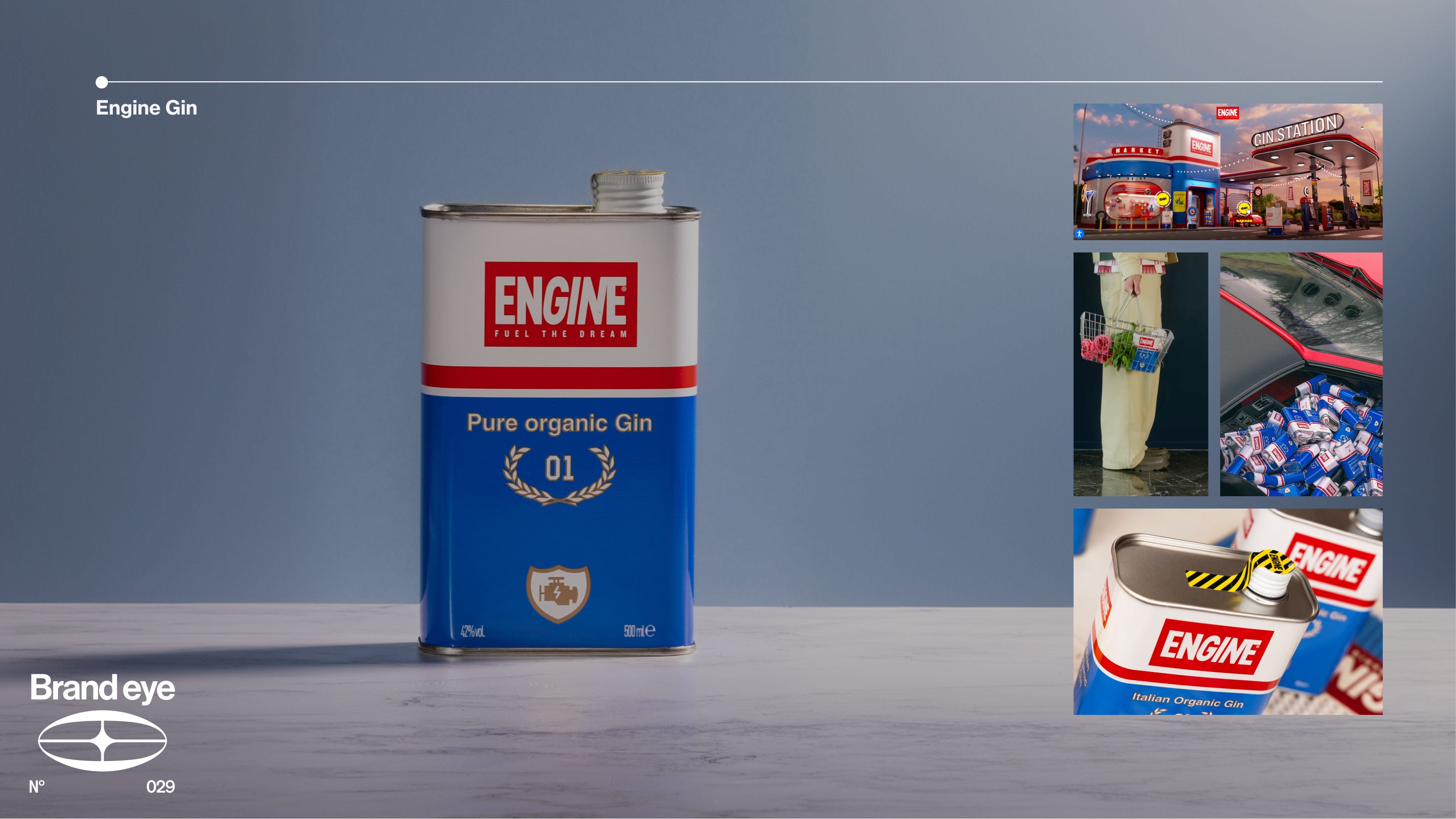
Bottle - Engine is maybe the most original of the lot. It comes in a tin made to look like a can of engine oil (by the brand’s account, the first gin ever sold in one) and swaps gin’s Victorian references for seventies and eighties car culture.
Brand - A super cohesive brand world. It started in founder Paolo Dalla Mora’s garage in Barbaresco, where he was working on his motorbike and drinking the local Langa digestive of hot water, lemon peel and sage. The flavours became the gin and the garage became the identity. Dalla Mora also read the category first. Gin was getting cleaner and more transparent, so he went dirtier on purpose. That’s a Red Ocean Map and a Blue Ocean Move in one decision.
Outcome - A top bottle, but one that’s only possible because of elite-tier brand world building. You won’t get there by briefing a designer for a cooler bottle. It’s what will also allow Engine to not feel dated now that more brands are utilising the oil can as a means of standing out (that ships sailed).
So, bottle or brand?
Tanqueray’s bottle and name do the heavy lifting, but its lack of a brand world leaves it open to challengers. Mermaid leans on its bottle design without the brand world to back it up. One’s the incumbent and the other a newcomer, but they’re making a similar mistake for different reasons: each is sitting on a strong asset and wary of unsettling what works. Roku has a beautiful bottle and a story that doesn’t quite break out on its own. Hendrick’s, Sipsmith and Engine have bottles that came out of the brand, and they’re the ones you’d still be buying once the novelty’s gone.
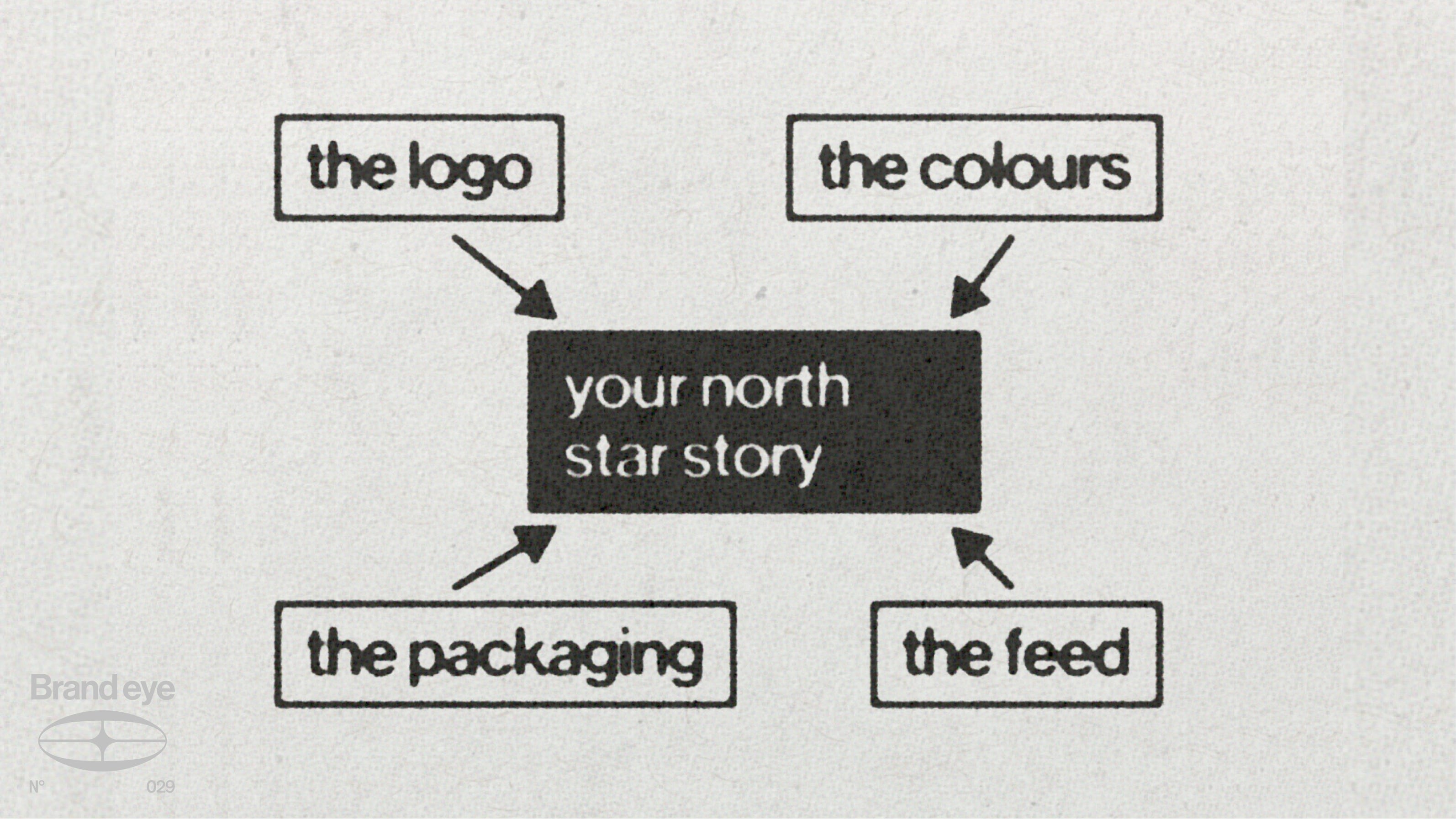
You need both, but good packaging usually flows from cohesive branding. Starting with the brand makes the design simpler, because the logo, the colours, the packaging and the feed all point back to the same story. It rarely works the other way round.
Want to know which of the eight your brand is missing? Take the Brand World Score. Eight questions, one per move, and it shows you exactly where your brand world breaks.